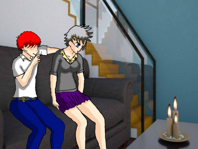
I realized i haven't uploaded anything about my visual novel project Hypnotic Student:Infiltration of Kuro Highschool. So i decided to draw the first hypnosis scene of the game even though this scene is not going in the game for a while based where i am in the game atm. I decided to use the second character option for this one. Because in the game you have small character customization, this is the second character option. If the player chose that option then this image would show up in the game. If they chose the first option the red hair would to change to the option the player chose. I'm having trouble with figuring out the tags to use can someone help me out?
I'm going to forward this to the QCC. The drawn segment of the image is pretty good (I actually like the colors and shading), even if the lines are a little unsteady. It's primarily the clashing artstyles of the characters vs. the environment that is a cause for concern to me.
Vanndril said: I'm going to forward this to the QCC. The drawn segment of the image is pretty good (I actually like the colors and shading), even if the lines are a little unsteady. It's primarily the clashing artstyles of the characters vs. the environment that is a cause for concern to me.
That's understandable just know that this image is going to be used in my game Hypnotic Student with little to no modification because other then adjusting the line there's really not a lot I can do to improve it
>> #159211
Score: 0 (vote Up)
>> #159249
Score: 0 (vote Up)
>> #159252
Score: 0 (vote Up)
Sweet.
Thanks :)
>> #159885
Score: 0 (vote Up)
>> #160093
Score: 0 (vote Up)
I'm going to forward this to the QCC. The drawn segment of the image is pretty good (I actually like the colors and shading), even if the lines are a little unsteady. It's primarily the clashing artstyles of the characters vs. the environment that is a cause for concern to me.
That's understandable just know that this image is going to be used in my game Hypnotic Student with little to no modification because other then adjusting the line there's really not a lot I can do to improve it