Search
(Supports wildcard *)Copyright
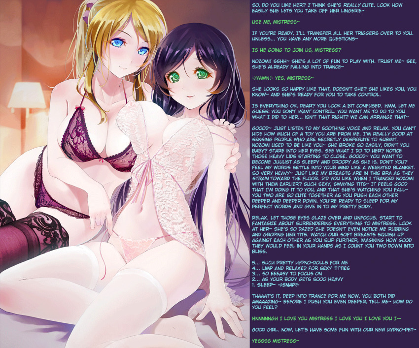
- ? love live! 275
- ? love live! school idol project 165
Character
- ? eli ayase 72
- ? nozomi toujou 90
Artist
- ? okingjo 4
- ? ta75 (manipper) 80
General
- ? bare shoulders 5734
- ? bed 2518
- ? black hair 31027
- ? blonde hair 33796
- ? blue eyes 17557
- ? blush 37376
- ? bra 4197
- ? bragging 165
- ? breast press 1802
- ? breasts 105522
- ? cleavage 23300
- ? collarbone 7527
- ? countdown 129
- ? curvy 355
- ? erect nipples 16761
- ? female only 58220
- ? femdom 30493
- ? femsub 134892
- ? finger snap 723
- ? green eyes 9646
- ? happy trance 47261
- ? hourglass figure 400
- ? huge breasts 22717
- ? hypnotic breasts 1124
- ? large breasts 58897
- ? legs 3714
- ? lingerie 2218
- ? long hair 58822
- ? looking at viewer 12851
- ? male pov 2167
- ? midriff 5863
- ? multiple subs 10002
- ? navel 12836
- ? panties 8532
- ? ponytail 12614
- ? pov 8735
- ? pov sub 5050
- ? purple hair 11456
- ? see-through 2404
- ? sitting 6145
- ? sleep command 659
- ? smile 29206
- ? spiral eyes 24196
- ? sub on sub 1030
- ? symbol in eyes 32735
- ? thighhighs 17945
- ? thighs 2734
- ? underwear 11528
- ? undressing 6221
- ? very long hair 4571
- ? yuri 6431
Meta
- ? animated 9042
- ? animated eyes only 1270
- ? animated gif 6571
- ? caption 8965
- ? manip 16757
- ? text 84410
Statistics
- Id: 113708
-
Posted: 2021-04-01 11:35:21
by TA75 - Size: 1342x1116
- Source: www.pixiv.net/en/artworks/46963542
- Rating: Questionable
- Score: 337 (vote up)
This image has been resized. Click here to view the original image.
Always view original.
Don't show this message.
1

>> #413113
Score: 0 (vote Up)
discord.gg/MKDJwJu2
Also I have a bigger version of the gif here but I didn't post it cause it looks like crap in the browser:
mega.nz/file/GQRV3CDB#Cbg...qvP0-PRB0UUMahYuvKKtt1XFY
>> #413118
Score: 0 (vote Up)
>> #413123
Score: 0 (vote Up)
So, well done. Like the Font, color coding is nice, good choice of colors, very readable.
2 Things to improve would be trying to blur the pixels where it goes over to the text background. This makes the crossing between picture and text less sharp. It depends though if you like it and is definetly a minor thing. The second thing would be trying to not make your text bound to the right or left, but format it into blocks, so it looks like it covers the area better. Another minor issue though.
>> #413151
Score: 0 (vote Up)
I feel like I have to praise every picture that actually takes the time to manip (or even animate) the picture instead of just putting a story next to it with Times New Roman font.
So, well done. Like the Font, color coding is nice, good choice of colors, very readable.
2 Things to improve would be trying to blur the pixels where it goes over to the text background. This makes the crossing between picture and text less sharp. It depends though if you like it and is definetly a minor thing. The second thing would be trying to not make your text bound to the right or left, but format it into blocks, so it looks like it covers the area better. Another minor issue though.
Thanks!
In this particular manip it might be a mistake to blur those pixels because it's a gif with a LOT of different colors and I wouldn't want to take any away from the actual image. It wasn't something I ever minded but I will think about it for next time.
wrt text justification I never liked center-justified text (I assume that's what you're talking about) personally but I know a lot of caption writers use it.
>> #413198
Score: 0 (vote Up)
>> #413248
Score: 0 (vote Up)
Thanks!
In this particular manip it might be a mistake to blur those pixels because it's a gif with a LOT of different colors and I wouldn't want to take any away from the actual image. It wasn't something I ever minded but I will think about it for next time.
wrt text justification I never liked center-justified text (I assume that's what you're talking about) personally but I know a lot of caption writers use it.
You can bypass this by cutting out the part in between (or copying it), putting it on a new transparent layer, blurring only the cut out part and putting the layer on top. That would not influence the gif in a negative way. However, yeah, I get your point why it is harder for gifs.
As for text, there is left-bound, right-bound, centered AND Block. Block stretches out the text over the whole area of the text block, meaning it creates a bit of space in between the letters and words automatically. It's basically only 1 button press. Actually, it is hard to find any caption writer on this page using it at all, but it is used in printed media a lot (books and magazines).
>> #413259
Score: 0 (vote Up)
You can bypass this by cutting out the part in between (or copying it), putting it on a new transparent layer, blurring only the cut out part and putting the layer on top. That would not influence the gif in a negative way. However, yeah, I get your point why it is harder for gifs.
Can you give me an example? I'm not following you.
Oh ok, yeah I always called that justified text. I'll definitely consider using it for the larger paragraphs, but wouldn't it look bad for the countdown?
>> #413274
Score: 0 (vote Up)
Can you give me an example? I'm not following you.
I can't sadly but I can give you a step by step instruction.
1. Create new layer -> visible
2. Remove everything that is not the crossover you want to blur (the removed areas will become transparent)
3. Blur the rest by using Gaussian Blur
If you have an animation, you might need to add it to the very first frame and then animate from that point on. Gifs are usually optimized by discarding all information that do not change in the next frame, so this doesn't have an impact on size and only needs to be present for frame 0.
Oh ok, yeah I always called that justified text. I'll definitely consider using it for the larger paragraphs, but wouldn't it look bad for the countdown?
You will have to play around with that if it looks good, but you could just use that block formating for everything else but the countdown and then actually animate the countdown for example, letting it go from 5 to 1 and then after a short break (5 secs) repeating the numbers with text. That would have an even stronger impactbecause the most important part of the story is being emphasized that way. But I guess, that is a personal preference and every manipper/artist likes to do stuff their own way.