Search
(Supports wildcard *)Copyright
- ? dragon's crown 75
Character
- ? sorceress (dragon's crown) 62
Artist
- ? cradily (manipper) 164
- ? ookami yuuki 1
General
- ? bare shoulders 5691
- ? barefoot 12090
- ? breasts 104874
- ? brown hair 29653
- ? dazed 12702
- ? empty eyes 36612
- ? expressionless 20654
- ? feet 9118
- ? female only 57842
- ? femsub 133867
- ? hat 7169
- ? huge breasts 22496
- ? hypnotic accessory 7843
- ? long hair 58529
- ? open clothes 5971
- ? open mouth 47474
- ? witch 883
- ? witch hat 805
Meta
- ? manip 16689
- ? spoilers 507
- ? text 83858
Statistics
- Id: 13699
-
Posted: 2014-04-12 12:50:08
by Cradily - Size: 2000x1422
- Source: www.pixiv.net/member_illust.php?mode=medium
- Rating: Questionable
- Score: 280 (vote up)
This image has been resized. Click here to view the original image.
Always view original.
Don't show this message.
1

>> #15010
Score: 0 (vote Up)
The goal was to practice 'doing' shading and make the prop look like it's part of the image. What do you think? (and how could I make it better?)
>> #15015
Score: 0 (vote Up)
^^^IMAGE SPOILER ALERT^^^
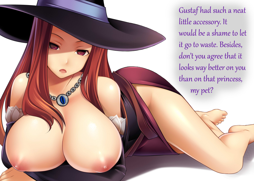
So I found this picture that I wanted to manip, and was looking for some ideas on how to manip it. Decided to look up the info on Dragon's Crown since I haven't played the game and I found that they have hypnosis going on in the plot! So I just used that element for the picture. Which also leads to the manip having the spoiler itself. Not quite sure how to get around that.
The goal was to practice 'doing' shading and make the prop look like it's part of the image. What do you think? (and how could I make it better?)
There is a "Spoilers" tag. Feel free to add it
>> #15016
Score: 0 (vote Up)
Regards, Master of all laughter,
LolLord
>> #15022
Score: 0 (vote Up)
The goal was to practice 'doing' shading and make the prop look like it's part of the image. What do you think? (and how could I make it better?)
The thick outlines stand out a little, as does the blue part in the middle. Also, I feel there's a lack of shading. Still, good job overall.
>> #15081
Score: 0 (vote Up)
The thick outlines stand out a little, as does the blue part in the middle. Also, I feel there's a lack of shading. Still, good job overall.
Thanks for the feedback =D (Needs more shading, darn. lol)
>> #15112
Score: 0 (vote Up)
>> #45611
Score: 0 (vote Up)
>> #203706
Score: 0 (vote Up)