Search
(Supports wildcard *)Copyright
- ? original 43361
Character
- ? sela (real xxiii) 78
Artist
- ? real xxiii 90
General
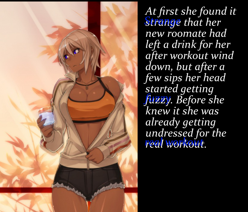
- ? blonde hair 33543
- ? breasts 104873
- ? dark skin 8764
- ? femsub 133862
- ? hypnotic drink 545
- ? hypnotic drug 883
- ? large breasts 58671
- ? short hair 41299
- ? short shorts 882
- ? undressing 6178
Meta
- ? caption 8943
- ? manip 16689
- ? text 83857
Statistics
- Id: 23374
-
Posted: 2015-02-19 00:48:16
by Joke-smith - Size: 829x708
- Rating: Questionable
- Score: 67 (vote up)

>> #46688
Score: 1 (vote Up)
>> #46690
Score: 0 (vote Up)
>> #46693
Score: 0 (vote Up)
The text is simplistic, but I think it's fine to be simplistic. It explains the scene and leaves a lot up to the imagination in just two sentences.
Everyone uses different fonts, but my normal recommendation is Anime Ace or a plain Sans font for some text, if you'd like to experiment with those a bit!
Also, when you upload a manip, if you have a source link, please include it if you can ^^
>> #46716
Score: 0 (vote Up)
There's not really a source, so I can't really comment on how manipped the drink and the eyes are(if they are at all). One thing is that you should try and format your text so that it's a bit more spaced out and centered if you're partitioning a separate portion from the picture part. Also, there's a great thread on the forums that really goes into how to break into making manips(<<hypnohub.net/forum/show/2317|Here>>)
Guides in there range from the basics of using GIMP and getting started(by PomPom) to making advanced gifs via programming(from EdgeOfTheMoon).
I just started making manips and stories myself a bit more than a month ago, so I'd be happy to swap stuff with ya for both feedback and critique, as I'm always looking for input to get better.
>> #47282
Score: 0 (vote Up)
So: your blue S in the figure 'strange' is a capital letter. The s in the white ground is a lowercase letter. That is inconsistent.
You also used blue type on a black background. This is a sin because blue blends into black. On it's own its hard to read. The placement makes it seem like they are actively floating above the seen, shining white light down. This clashes with your otherwise appropriate content.
Water is a missed opportunity in my eyes. I'd use color manipulation tools in raster editor to make that stuff blue (or whatever color I chose to make here eyes and the type.
Also, because I want your opinion rather than mine: What tone or mood did you want this to project?