Search
(Supports wildcard *)Artist
- ? 111 (manipper) 24
General
- ? black hair 30861
- ? candle 196
- ? chains 1235
- ? female only 57841
- ? femdom 30351
- ? looking at viewer 12777
- ? pov 8663
- ? pov sub 5033
- ? red eyes 9574
- ? thighhighs 17834
Meta
- ? caption 8944
- ? caption only 2827
- ? manip 16689
- ? text 83858
Statistics
This image has been resized. Click here to view the original image.
Always view original.
Don't show this message.

>> #50061
Score: 0 (vote Up)
also don't just be a looke lo please comment or tag
I HAVE SPOKEN
>> #50064
Score: 0 (vote Up)
>> #50065
Score: 0 (vote Up)
Interesting, if swift, turn of events. Might be interesting to see more of her as she debates falling.
that was what I was going for its probably something all doms think at one point
sorry but its the only image I've got of her
my favourite part was at the very end with her saying again I can just imagine it going to black just before saying it
>> #50069
Score: 0 (vote Up)
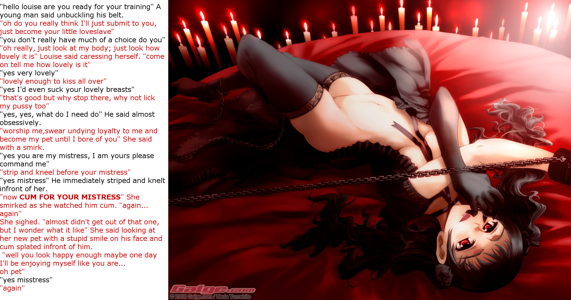
- White background for text instead of using the color palette of the picture
- Font to close to border of picture (leave space)
- No visual sign of mind control
>> #50076
Score: 0 (vote Up)
- Standard Font
- White background for text instead of using the color palette of the picture
- Font to close to border of picture (leave space)
- No visual sign of mind control
I'll add "Incorrect and/or missing capitalization and punctuation" to that list. Also, in manips where all you have is dialogue between two characters, quotation marks aren't really necessary.
>> #50079
Score: 0 (vote Up)
>> #50082
Score: 0 (vote Up)
I'll add "Incorrect and/or missing capitalization and punctuation" to that list. Also, in manips where all you have is dialogue between two characters, quotation marks aren't really necessary.
You are absolutely right - I didn't even see that.
If you have no idea which font to use, Wild Words is the Standard Font used by hundreds of Manga Translations, so it will always be something that people relate to when seeing Manga Images with text. As a personal touch, I like to make the font where people talk white, with a colored outline, matching the color theme of that person (e.g. hair color). This works especially well with darker backgrounds.
And one more thing that may be personal preference, but most of us start looking from the left to the right for pictures and the other way around for reading (mangas are that way). Putting the text on the right side of the picture may have a huge impact for some people, because they first look at the picture and then read the text - the other way around they are confronted with text, which immediately kind of dulls down the whole experience. For some people this happens on a subconcious level.
If you revised the image with everything we said I can see you getting above 20 or even 30 score easily because the Base Image is pretty nice
>> #50088
Score: 0 (vote Up)
- Standard Font
...
- White background for text instead of using the color palette of the picture
...
I would question these two points.
Personally, on the font I think what you mean to say is that 111 did not use the manga standard translation font or a script font. These are not to everyone's taste... a script font catches the eye there are always consequences. Consult typography text books/blogs/wikipedia to learn more. Similar fonts are papyrus and comic sans, which are slightly infamous in printing due to over use, though I could see Comic Sans having applications in manipping. Papyrus and me do not get along.
The font is probably Verdana. It is a very common web font but, and it is possible that on 111's system the software he was using picked it as a standard... on the other hand MS updated its fonts to Tahoma, Calibri and Segoe. Verdana also has a black reputation because it is web optimized and does not play well with others or on print. Ikea liked it though.
As for color, I think this is a special case where white works. The background is white, the text is red and black. The color of the image is generally, red, black, white and fleshy bits.
Compared to the alternatives of a black background with red and white text, or a red background with white and black text, I think the white with red and black text works out better (or some combination of flesh tone, which would be way subtle).
For first shots it is decent.
>> #50100
Score: 0 (vote Up)
- Standard Font
honestly it didn't think the font mattered
- White background for text instead of using the color palette of the picture
white is always easy to read from
- Font to close to border of picture (leave space)
while writing or moving the text box it would jump around
that was the best I could do
- No visual sign of mind control
simple its caption only
I don't have enough skill to edit a picture without ruining it
Incorrect and/or missing capitalization and punctuation
I try my best to use proper punctuation but everyone was taught a little different from each other
my main beef is with grammar though I don't think I made any mistakes
in manips where all you have is dialogue between two characters, quotation marks aren't really necessary.
its a habit I picked up from when I wrote books were I was taught "if its spoken use quotation marks"
For first shots it is decent.
technically this was my fourth shot but thanks its the best thing someone said about this one along with Tejyasn's comment
sorry for such a long comment
>> #50114
Score: 0 (vote Up)
I try my best to use proper punctuation but everyone was taught a little different from each other
my main beef is with grammar though I don't think I made any mistakes
its a habit I picked up from when I wrote books were I was taught "if its spoken use quotation marks"
*Sigh* I know I'm not really active here or anything, as I just browse this site, but frankly, For someone who wrote books, this is a poor attempt at erotica. If all else, just find someone, anyone, with the patience enough to proofread your work.
Secondly, the lack of effort you apply to your reasoning is beyond jarring, its genuinely terrifying. You wrote books? Then at least TRY to have capitalization at least, and punctuation. Now I understand misspelled words completely, some people's first language isn't English, so I understand. But Please, please strive for punctuation and capitalization.