Search
(Supports wildcard *)Copyright
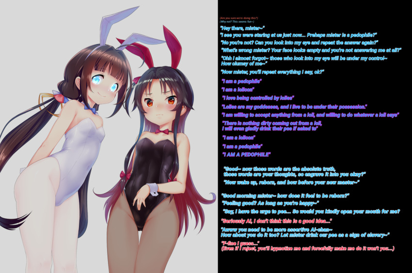
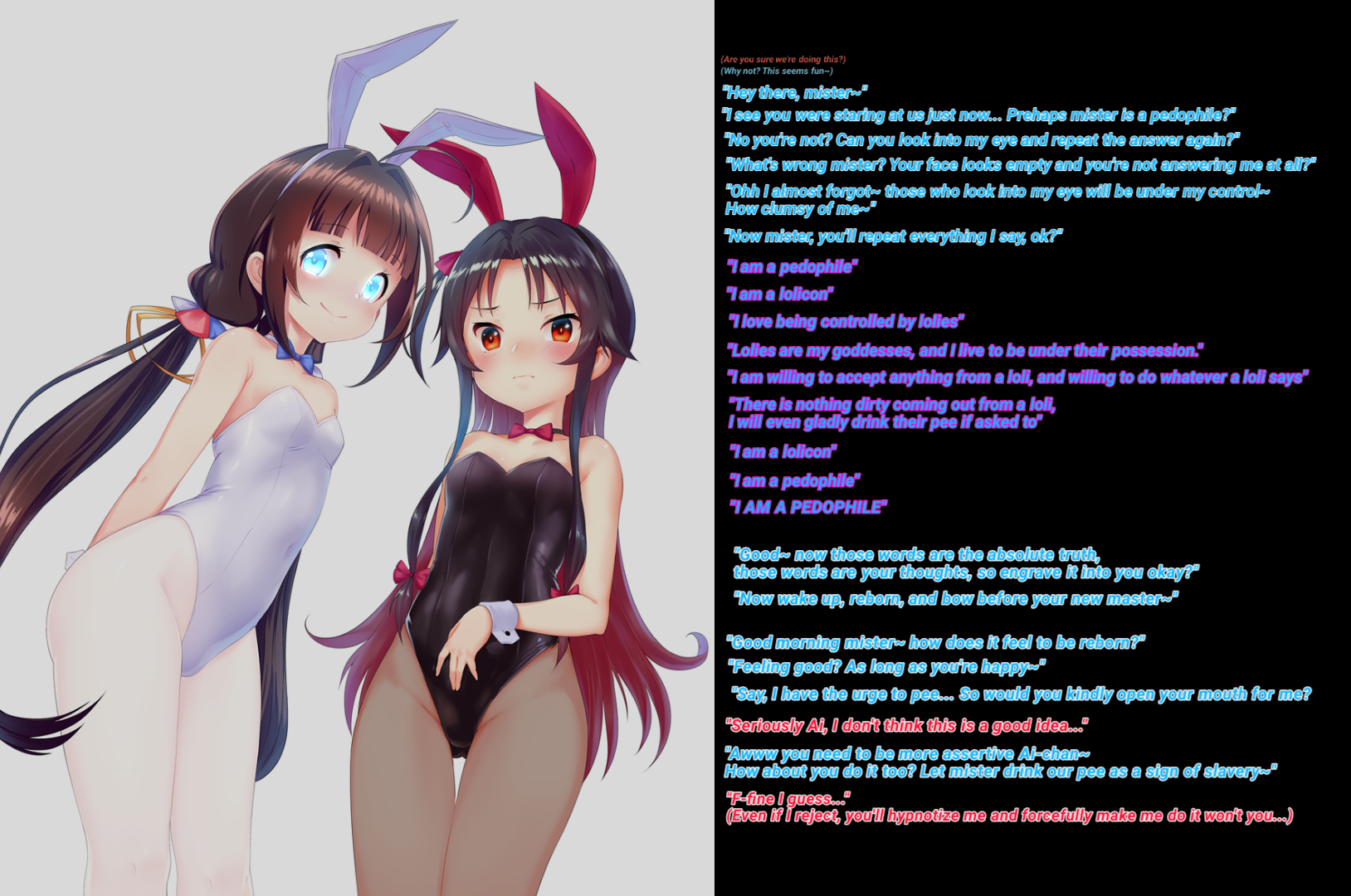
- ? ryuuou no oshigoto! 2
Character
- ? ai hinatsuru 1
- ? ai yashajin 1
Artist
- ? babu 1
- ? hypnodave (manipper) 31
General
- ? black hair 31072
- ? brown hair 29922
- ? bunny ears 2462
- ? bunnysuit 1939
- ? cuffs 1487
- ? fake animal ears 2705
- ? female only 58300
- ? femdom 30521
- ? glowing 16109
- ? glowing eyes 17038
- ? hypnotic eyes 10200
- ? looking at viewer 12852
- ? pantyhose 2463
- ? pee drinking 68
- ? pov 8749
- ? pov sub 5054
- ? smile 29247
Meta
- ? caption 8968
- ? manip 16767
- ? text 84526
Statistics
- Id: 67391
-
Posted: 2018-07-28 20:34:00
by HypnoDave - Size: 1628x1080
- Source: www.pixiv.net/member_illu...um&illust_id=69464428
- Rating: Questionable
- Score: 122 (vote up)
This image has been resized. Click here to view the original image.
Always view original.
Don't show this message.

>> #272291
Score: 2 (vote Up)
( ˘ω˘ )
>> #272294
Score: 1 (vote Up)
>> #272296
Score: 0 (vote Up)
Can't read the text very well...
You need to view larger version to read it properly sorry
Also the hub slightly watered down the quality which does make it hard to read...
>> #272314
Score: 2 (vote Up)
You literally *have to* lewd the loli.
>> #272327
Score: 0 (vote Up)
You need to view larger version to read it properly sorry
Also the hub slightly watered down the quality which does make it hard to read...
Better use normal text with colors, additional effects only overload the manip and make it more hard to read.
In any case, the text can still be read at full resolution xD.
>> #272338
Score: 0 (vote Up)
>> #272402
Score: 1 (vote Up)
You need to view larger version to read it properly sorry
Also the hub slightly watered down the quality which does make it hard to read...
Remember, the general rule of text shadows/outlines is to contrast the TEXT color. If the outline color is to similar to the text color, such as the white on cyan or purple on blue in this example, it can range from moderately displeasing to look at to actually reducing readability instead of increasing it. Finally, its also worth knowing if the shadows are necessary. When placing text over an image, they're almost always recommended. But when you're putting text on top of a solid color, they're generally not needed unless the text color is too similar to the background color. Considering the text background here was black, and none of the font colors were extremely dark, I feel like you could have very easily gotten away with not using them.
>> #272987
Score: 0 (vote Up)
>> #273778
Score: 0 (vote Up)
>> #273832
Score: 0 (vote Up)