Search
(Supports wildcard *)Copyright
- ? mahoromatic 1
Character
- ? mahoro andou 1
Artist
- ? deathwish (manipper) 124
General
- ? all fours 3567
- ? ass 14341
- ? blue hair 13166
- ? bottomless 40888
- ? breasts 103615
- ? cleaning 130
- ? crystal 1146
- ? feet 9014
- ? femsub 132276
- ? long hair 58080
- ? looking back 1621
- ? maid 3874
- ? nude 38624
- ? ponytail 12320
- ? pussy 17874
- ? socks 2107
- ? topless 44593
Meta
- ? caption 8919
- ? manip 16636
- ? text 82464

>> #4470
Score: 0 (vote Up)
There's nothing wrong with the text, per se, but the way it reads makes it seem like one of those terrible manips you see people make fun of all the time. Like "Who are you? What is that? Oh no can't think. Can't. Yes master I obey." It all seems to run together. I think doing something with the text to show her going under would be a good idea. Like make the text change color and maybe change font. A clear distinction between the "awake" her and the entranced her would help the flow a bit.
And speaking of changing fonts: is there anything, anything at all, I can do to convince you to stop using Comic Sans? Putting aside the fact that it's just an ugly font, it makes all your manips look low-tier no matter how much work you put into them. Comic Sans is basically the first font besides Times New Roman anyone seems to learn how to use. It just gives the impression of an amateur. There are dozens of comic-style fonts available for free online, and they're all infinitely better.
That's all I wanted to say. Really not as "brutal" as I thought.
>> #4493
Score: 0 (vote Up)
And I hope it's not a problem if I put my two cents in as well since I think critique is a necessary step for improvement, and I myself always welcome even the most brutal of critiques as long as it is constructive. (hint hint)
anyway....
So like Mindwipe states, change your font and work on the writing. The text itself in no way hints at any form of hypnosis, it just, sort of happens. When you write a narrative pretend that there is no image, help the reader build a scenario completely in their head and have the image there just to complement the text. If your trying to make dialogue make it realistic too, in this the subject is complaining and then just suddenly starts muttering hypno mumbo jumbo that feels like it was forced in. If the dialogue has no realistic flow then it makes it painful to read. Look at other people's manips with text and try to see how they make the text flow smoothly and make the transition into a trance slower, unless you are going for a "sudden trance" then you have to express that in the text somehow.
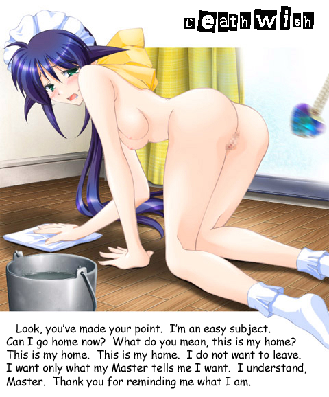
Also in terms of visuals you need a lot of work. You have to pick an image and determine whether this image has potential to be manipped and if it is good quality, low quality images make for awful manips no matter what you do to it. ALWAYS ACCOUNT FOR ARTSTYLE, if the art looks sketchy the manip cant clash and have sharp vector lines or it looks ugly, and if an image is all sharp edges, cell shading with no graidents then avoid manipping soft edges and gradients. Also make sure the image you chose his high quality. For example hypnohub.net/post/show/10639 the eyes dont have the same paper texture as the rest of the image, those stamped music notes are just ugly, and there is some brown from the skin bleeding into the blurred eyes, and just simply blurring the eyes without putting any effort in isnt very attractive. What you can do is adjust the facial expression or add other elements into the image to make it more themed with hypnosis. Picking a random image is a bad idea since some images have more potential for a good manip than others.
And stamping a blurry pendulum on an image without doing anything else is just lazy.
hypnohub.net/post/show/10266 here the edges of the iris are blurry as well. I can go on but I have other points to make.
When it comes to text, the whole putting black text in a white box on the side is also unattractive. Try to put the text in the image itself or pick images with a white or solid colour backgrounds so you can incorporate it into a larger white space to fit more text. Also pick something other than black and white sometimes, use the colour of the speakers eyes or hair or use the dominant colour in the image because black can be such an ugly colour. Also dont forget to use italics and bold to emphasize certain points or you can even change the colour of the text slowly to show a transition into a trance. Organize your type in a way that isnt just an ugly black and white box on the side, Mindwipe and Vandril's manips are a great examples of using text well if you need examples.
Finally that watermark is a huge eyesore, I HIGHLY recommend redrawing it so it isnt so pixely, make it a lot smaller, make it a lot more faded. Try not to let it steal the attention.
Or just remove it entirely, I really don't understand the reasoning behind watermarking a manip, original artwork makes sense to watermark but manips usually dont take more than an hour, max, and most of the drawing has already been drawn by the artist before hand.
I've been seeing your manips since the times of hypnochan and I always thought that you would have made huge improvement by now, but it seems like you just churn out low quality manips like a factory without putting much effort into them on an individual basis, thats only an assumption but I still think that you should spend a few more minutes on each manip. As harsh as I may sound it is just my way of showing good intent.
/end wall of text
>> #4497
Score: 0 (vote Up)
-Huge Tablet of Text-
-Great Monolith of Text-
Seems people are finally starting to crack down on manips... I'd better be on my game. o_o'
>> #4499
Score: 1 (vote Up)
Seems people are finally starting to crack down on manips... I'd better be on my game. o_o'
STOP HAVING FUN, I DO NOT ALLOW FUN.
In all seriousness though it's just my personal thoughts on the matter, not an objective truth, as long as there is some effort evident or it looks nice then everyone is happy.
>> #5616
Score: 0 (vote Up)