Search
(Supports wildcard *)Copyright
- ? fire emblem 2587
- ? fire emblem awakening 578
- ? nintendo 21638
Character
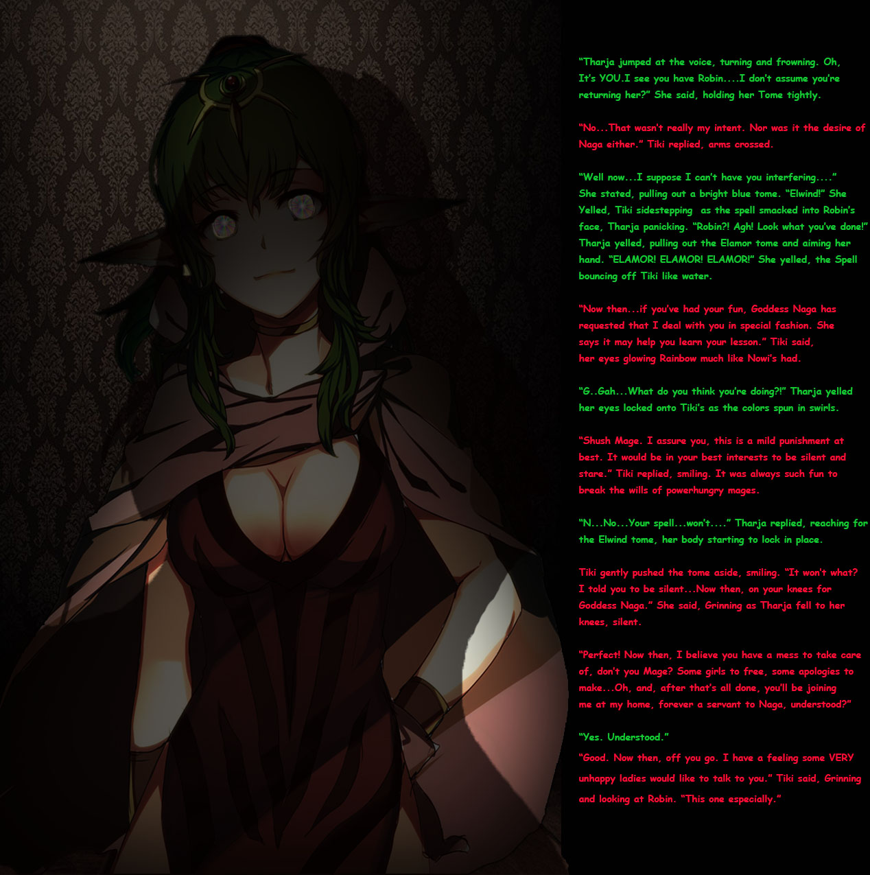
- ? tiki (fire emblem) 69
Artist
- ? princesslucina (manipper) 102
General
- ? blush 36679
- ? femdom 30066
- ? femsub 131929
- ? green hair 6122
- ? hypnotic eyes 10026
- ? magic 7582
- ? purification 183
Meta
- ? caption 8907
- ? manip 16632
- ? text 82312
Statistics
- Id: 28033
-
Posted: 2015-08-02 10:33:30
by PrincessLucina - Size: 1268x1275
- Source: www.gelbooru.com/index.ph...amp;s=view&id=2515342
- Rating: Questionable
- Score: 72 (vote up)
This image has been resized. Click here to view the original image.
Always view original.
Don't show this message.

>> #65477
Score: 0 (vote Up)
>> #65478
Score: 0 (vote Up)
A couple of problems I see with your manips though (mainly the text):
- Lots of text and always pretty small, maybe less is an option? Or split it into one text on the right and one on the left? Makes it easier to read on portable/small devices.
- Different colors make it good to see the difference between the persons talking, but try to make the flavortext (e.g. "Tiki gently pushed thetome aside, smiling.") a third color if possible. A blank white would probably fit best if you use a black background.
- You are using a lot of "dialog xyz" abc said/abc replied/abc yelled/abc exclaimed - almost exclusively through all your text. Try to mix it up and not include stuff like "blablub", Tharja said - if you can use the color to make it obvious which person is talking.
I see no problems with the graphical parts in this manip, but if you can make your story flow a little better it'll be even better. :)
>> #65479
Score: 0 (vote Up)
I really, REALLY like the darkness in this manip. It's well done.
A couple of problems I see with your manips though (mainly the text):
- Lots of text and always pretty small, maybe less is an option? Or split it into one text on the right and one on the left? Makes it easier to read on portable/small devices.
- Different colors make it good to see the difference between the persons talking, but try to make the flavortext (e.g. "Tiki gently pushed thetome aside, smiling.") a third color if possible. A blank white would probably fit best if you use a black background.
- You are using a lot of "dialog xyz" abc said/abc replied/abc yelled/abc exclaimed - almost exclusively through all your text. Try to mix it up and not include stuff like "blablub", Tharja said - if you can use the color to make it obvious which person is talking.
I see no problems with the graphical parts in this manip, but if you can make your story flow a little better it'll be even better. :)
Sounds good! Well, Improvement is ALWAYS an option! I do tend to use it a lot, just because that's how I usually specify speech, but, I can try not using it, and, I'll try out the Text Enlarging too. I can usually read it just fine, but, I understand how it can be tough on Mobile.
>> #65480
Score: 0 (vote Up)
>> #65481
Score: 0 (vote Up)
You have to also account for the site making your image smaller (especially if you edit higher res images) and fucking up an already small font. Thats why a bigger font is rarely a bad choice.
Noted. Yeah, I usually work with High-Res Images so I put out the best work I can. I'll try to get better with it.
>> #65508
Score: 0 (vote Up)
Only thing I can see that is strange.
>> #65511
Score: 0 (vote Up)
Purification tag?
Only thing I can see that is strange.
I put it as Tharja is basically going from Power-Crazy Dark Mage to The Servant of the Goddess of Protection (In Fire Emblem's World). It just seems to make sense.
>> #65517
Score: 0 (vote Up)
Purification tag?
Only thing I can see that is strange.
I think the best way to describe it would be reverse corruption. like instead of an angel girl becoming a demon girl, it's the other way around
>> #65525
Score: 0 (vote Up)
>> #65526
Score: 0 (vote Up)
hmm...mind if I make a fanfic outta this? I'm gonna change the ending though...
Sure! Just be sure to share it with me!