Search
(Supports wildcard *)Copyright
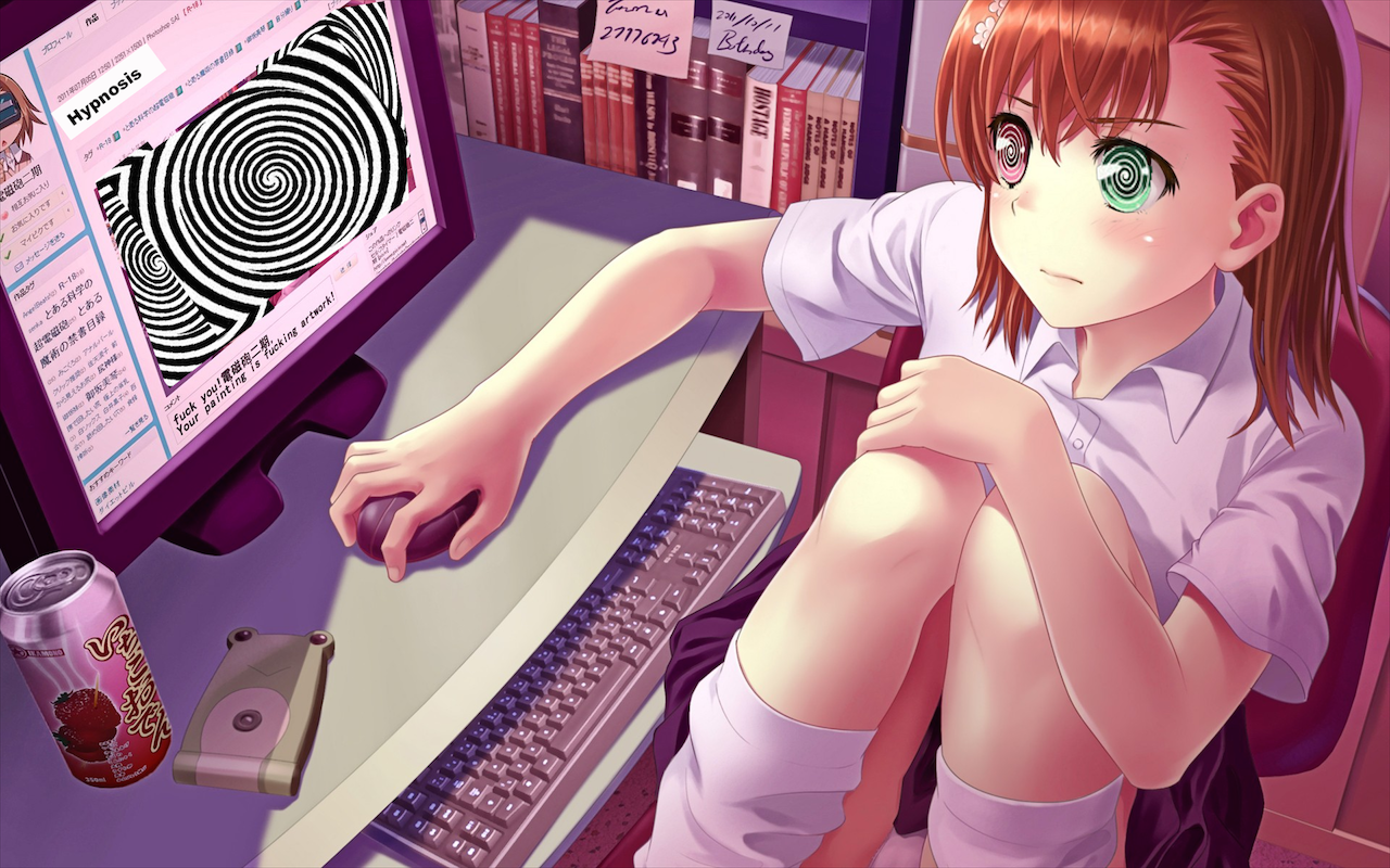
- ? a certain magical index 131
- ? a certain scientific railgun 161
Character
- ? mikoto misaka 92
Artist
- ? hypnolster (manipper) 1
General
- ? brown hair 29630
- ? computer 523
- ? expressionless 20625
- ? femsub 133726
- ? heterochromia 797
- ? hypnotic screen 2734
- ? sitting 6057
- ? socks 2127
- ? solo 21342
- ? spiral 6639
- ? spiral eyes 23979
- ? symbol in eyes 32502
- ? tech control 23241
Meta
- ? manip 16684
- ? text 83798
Statistics
- Id: 34167
-
Posted: 2016-02-27 15:43:58
by HypnOlster - Size: 1280x800
- Rating: Questionable
- Score: 85 (vote up)
This image has been resized. Click here to view the original image.
Always view original.
Don't show this message.

1

>> #90900
Score: 0 (vote Up)
>> #90901
Score: 0 (vote Up)
Please give me suggestions and requests if you have them :)
How about something from the new Fire Emblem games? Camilla comes to mind... Maybe something dominating female Corrine? Just a thought.
>> #90903
Score: 0 (vote Up)
Please give me suggestions and requests if you have them :)
More railgun :P and maybe some rwby
>> #90906
Score: 0 (vote Up)
<<dagobah.net/t200/hypnotized_by_desu.jpg|
And hey, those eyes look familiar... >>
>> #90916
Score: 0 (vote Up)
Please give me suggestions and requests if you have them :)
For a second there, I was real confused when I saw the avatar... Thought I'd gone sleep-posting or something.
>> #90921
Score: 0 (vote Up)
More railgun :P and maybe some rwby
+1 to both these requests.
>> #90939
Score: 0 (vote Up)
>> #90952
Score: 0 (vote Up)
HypnOlster -
You did good pretty well on the eyes. Though zooming in reveals some jagged borders, the errors aren't all too noticeable at default zoom, so it isn't that big a deal (though is still probably something you should try to learn to avoid - having manips look consistent even while zoomed in makes for good manips).
What's holding this image back is the work on the screen. As ZyxS said, The added text isn't aligned properly and is on a white background, which very obviously contrasts from the background of the webpage itself. In addition, the spiral added over the image does not fully cover the image and is pasted rather willy-nilly three times. It's these problems that really drag this manip's quality down.
Now, before I go handing this to the QCC, I feel like it would be a better idea to suggest that you try to remake this manip, fixing the quality issues outlined above. If you decide to try and manage to do so, you can post it here and it can replace this one. If not, I'll put it up for judgment and you can go on trying other, new things. Whichever you want to do.
Now, IF you decide to try fixing it, here's what I recommend you do:
Note: Tool names may not be exactly the same as what I describe here, as I use GIMP and have little experience with Photoshop. Still, they both have a similar selection of tools, so this is doable on either.
* Use the Color Picker tool to select the pink-ish color of the background on the screen. The lighter pink of the various pinks on the background, such as to the very right of where you pasted "Hypnosis". With that color chosen, use the Paintbrush tool to completely "erase" the pasted "Hypnosis" text and its white background, as well as the entire image that you pasted spirals over. This will give you a clean, consistent-looking framework to work from.
* Use the Text tool to type "Hypnosis" where you had it before, except on the pink background instead of the contrasting white background you use in this version. Use a combination of the Rotate and Perspective tools to make the text align properly on the screen. Just play around with different rotations and perspectives until it looks right to you. Don't be afraid to use the Undo feature to try again if it doesn't look good.
* Paste a single instance of the spiral image in the center of the screen, where the original image was located. The goal is to have it look like that spiral WAS the image on that page. Like with the "Hypnosis" text, use a combination of the Rotate and Perspective tools to make the image align properly on the screen. Play around with the tools until it looks right, and don't hesitate to Undo and try again if needed.
If you can't seem to get the new "Hypnosis" text and pasted spiral image to look right using the Perspective tool, in this case it should also work if you JUST use the Rotate tool to align the text and image properly on the screen, since the perspective of the screen in this image isn't really that different from a straight, head-on perspective. However, I still recommend you at least try to use the Perspective tool first, because it's an important manipping tool when it comes to using props.
>> #92051
Score: 0 (vote Up)
>> #114588
Score: 0 (vote Up)