Search
(Supports wildcard *)Copyright
- ? my little pony 3285
Character
- ? rainbow dash 385
- ? twilight sparkle 777
Artist
- ? stoic5 1
- ? waverun (manipper) 79
General
- ? animals only 1490
- ? bondage 6929
- ? femdom 30074
- ? femsub 131948
- ? gag 1328
- ? hooves 987
- ? non-human feet 2939
- ? riding crop 81
- ? ring gag 66
- ? spiral eyes 23755
- ? symbol in eyes 32218
Meta
- ? animated 8886
- ? animated eyes only 1266
- ? animated gif 6500
- ? manip 16635
- ? text 82321
Statistics
This image has been resized. Click here to view the original image.
Always view original.
Don't show this message.
1

>> #92499
Score: 0 (vote Up)
-waverun
>> #92527
Score: 0 (vote Up)
>> #92541
Score: 0 (vote Up)
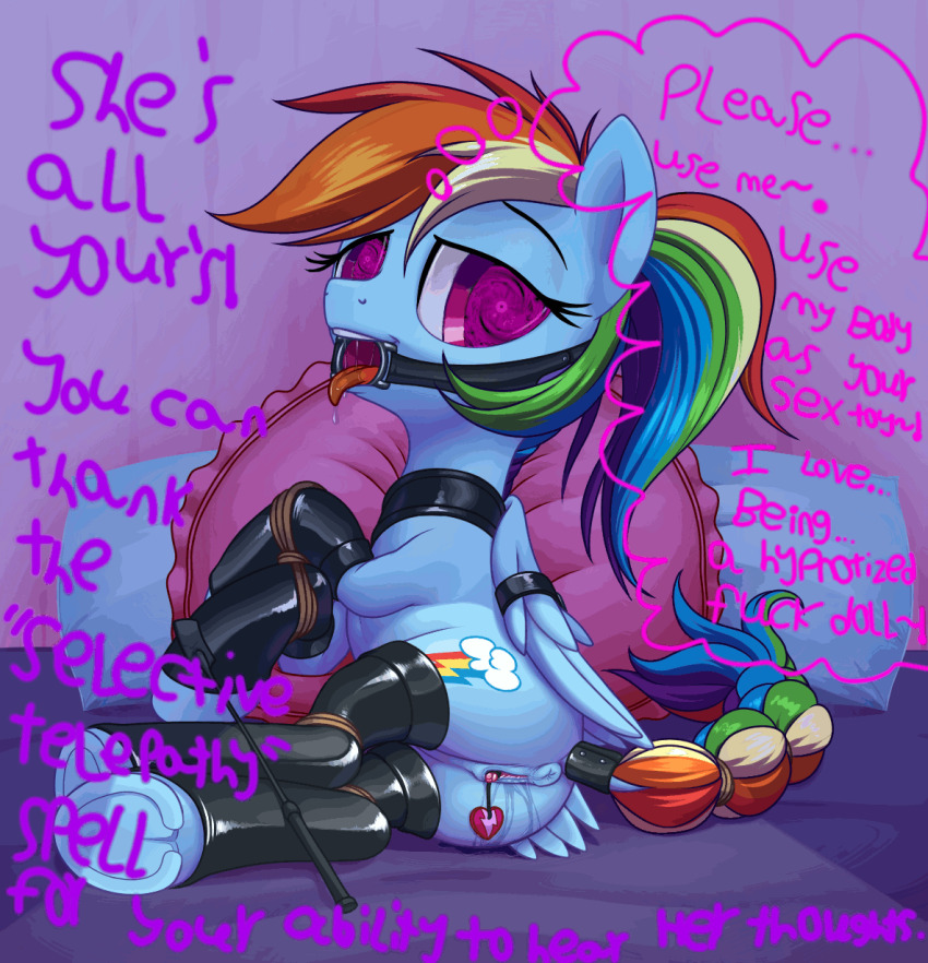
the text is a bit hard to read, might have been better to type it out in a font instead of drawing it on, it makes the whole image look a bit messy, and hard to read, still great though
Well he did say it was made quite a few months ago, so I'd say just a little leniency is due. Though the readability issue has been brought up in some of his more recent stuff, having even personally voiced a critique on the matter and suggested some possible solutions that could be employed in his future works.
>> #92601
Score: 0 (vote Up)
the thought bubbles don't even have background color/shading
>> #92608
Score: 0 (vote Up)
why is the text like a serial killer writing a note
the thought bubbles don't even have background color/shading
Like I said, I did this about 5 or 6 months ago. I didn't even know about the font tool in Gimp 2.8 back then.
>> #92632
Score: 0 (vote Up)