Search
(Supports wildcard *)Artist
- ? dmcman (manipper) 1
- ? tony taka 58
General
- ? beach 908
- ? blonde hair 33334
- ? breasts 103951
- ? brother and sister 399
- ? exhibitionism 1438
- ? femsub 132832
- ? hypnotic light 857
- ? incest 1347
- ? long hair 58205
- ? maledom 35700
- ? spiral eyes 23854
- ? symbol in eyes 32358
- ? topless 44768
- ? unaware 5721
Meta
- ? caption 8924
- ? text 83166
Statistics
This image has been resized. Click here to view the original image.
Always view original.
Don't show this message.
1

>> #100407
Score: 0 (vote Up)
>> #100414
Score: 0 (vote Up)
>> #100423
Score: 1 (vote Up)
>> #100455
Score: 0 (vote Up)
With the all caps and intense font, I can't help but imagine theyre yelling
Thanks Linkara.
>> #100486
Score: 0 (vote Up)
Thanks Linkara.
By the by, where'd he purchase that Magic Gun?
>> #100497
Score: 0 (vote Up)
By the by, where'd he purchase that Magic Gun?
I'd tell you, but that'd mean I'd have to buy the DVD.
>> #100505
Score: 0 (vote Up)
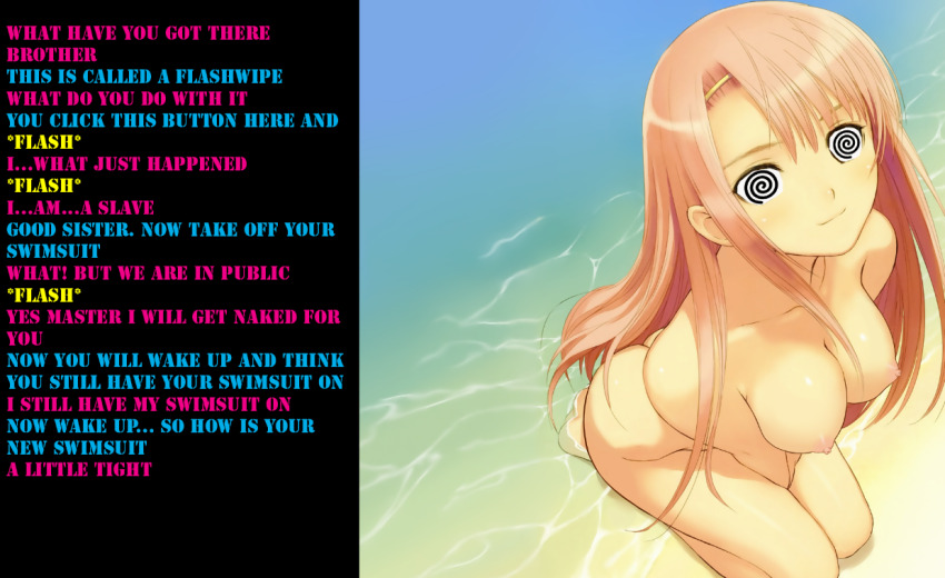
CAPS IT GETS HARD
*FLASH*
TO TELL WHAT IS HAPPENING EVEN
WITH THE BENEFIT OF MULTIPLE FONT COLORS
*FLASH*
AND GENERALLY IF THERE'S A LOT OF EMPTY
SPACE IN THE TEXT BOX THEN
MAKE THE WHOLE THING THINNER SO IT FITS
BETTER ON MORE SCREENS
*FLASH*
THE SUBJECT OF THE IMAGE IS WAY OVER
ON THE RIGHT SIDE SO IT DOESN'T MAKE
SENSE FOR THE TEXT TO BE ON THE LEFT
NOW MY EYES HAVE TO CROSS THIS NEGATIVE
SPACE IN ORDER TO GO BETWEEN
THE IMAGE AND TEXT
ALSO WHAT SPOON AND MEATBALLS SAID
>> #100569
Score: 0 (vote Up)
Things to consider:
- Font, Fontsize, Punctuation: A Better Font would be Wild Words, Anime Ace or general easy to read fonts. You used color coding for the text, which is great. Many people overlook this but it makes it easier to read. Without it, I wouldn't even know who is talking in this case.
- Position of Text manip: Wrong side. You want the text on the right side. Reason is that most of us read from left to right so we see the picture first, then look at the text. This is very important.
- Text Background: You used black. This is not always bad, but you got a very good chance in this picture to make a gradiant of the blue/greenish background color. If the text is on the other side, you should still use a much brighter background for the text, because the wall of black simply is a little bit too dark and the contrast is really harsh on the eye and the general mood of the picture.
- Eyes: Some say it could have been done better, I think it is decent for a first try. Then again, I am not into spiral eyes and do not know much about correctly implementing them. :)
Just try implementing these changes into your next manip and it will surely get a lot better. :)