Search
(Supports wildcard *)Copyright
- ? kid icarus 415
- ? nintendo 21680
- ? super smash bros. 272
- ? the legend of zelda 1514
Character
- ? palutena 379
Artist
- ? tecksfw 2
General
- ? armor 1168
- ? ball gag 789
- ? breasts 103658
- ? emblem 19
- ? femsub 132332
- ? gag 1325
- ? gladiator sandals 209
- ? goddess 934
- ? green eyes 9361
- ? green hair 6125
- ? helmet 1952
- ? high heels 10093
- ? jewelry 9665
- ? large breasts 58355
- ? long hair 58092
- ? necklace 3559
- ? shield 94
- ? standing 12476
- ? sword 769
- ? weapon 1200
Meta
- ? absurdres 34532
Statistics
- Id: 72801
-
Posted: 2018-12-14 03:01:25
by Bult - Size: 2480x3508
- Source: www.deviantart.com/tecksf...ype=edit&ga_changes=1
- Rating: Questionable
- Score: 12 (vote up)
This image has been resized. Click here to view the original image.
Always view original.
Don't show this message.
1

>> #294415
Score: 0 (vote Up)
>> #294418
Score: 0 (vote Up)
There is a story apparently involving MC if anyone questions the validity of that.
Please remember to tag the artist.
And while the MC may fit, I’m kind of iffy on the quality...
>> #294421
Score: 0 (vote Up)
Please remember to tag the artist.
And while the MC may fit, I’m kind of iffy on the quality...
Sorry just kinda new to this, reposting for a friend of mine. Is it the shitty background that is the quality problem or is it the drawing as a whole.?
>> #294422
Score: 0 (vote Up)
Sorry just kinda new to this, reposting for a friend of mine. Is it the shitty background that is the quality problem or is it the drawing as a whole.?
As a whole could use some work.
>> #294423
Score: 0 (vote Up)
As a whole could use some work.
I can delete it if you want?
>> #294424
Score: 0 (vote Up)
I can delete it if you want?
Your call. I’m not really goinf to call shots over it.
It would be nice to see the artist improve, though that’s ultimately up to them.
>> #294425
Score: 0 (vote Up)
Your call. I’m not really goinf to call shots over it.
It would be nice to see the artist improve, though that’s ultimately up to them.
well, let's help them, what do you think are the worse bits of it? it'll give the artist a clear area where they need improvement
>> #294433
Score: 0 (vote Up)
well, let's help them, what do you think are the worse bits of it? it'll give the artist a clear area where they need improvement
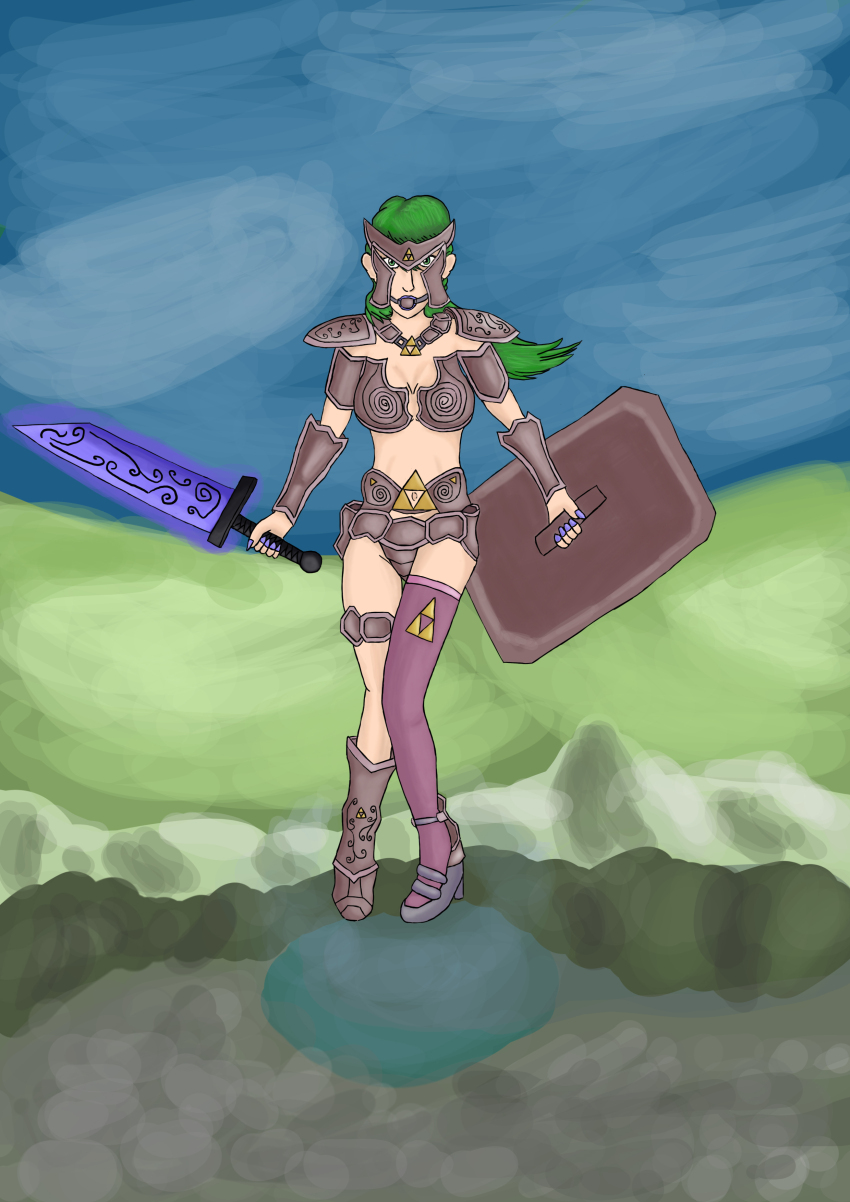
Background doesn’t need to be fully rendered, but the way it’s been handled here is distracting and doesn’t compliment the character at all. Like I can’t tell where she is nor what exactly she’s standing on with there being a bit of a warped perspective.
The coloring of the character in general clashes with the black line art. Cause it looks like the coloring is trying to render part of the image, but the line art takes away from it in regards to thickness and application in some areas.
The posing is stiff and awkward, and the anatomy looks kind of off, particularly in the right leg. Like the way it’s turned looks like a total side view of the leg rather than it being a bit inward.
Lastly, the armor, shield and sword all feel incredibly flat. They don’t give me a sense of perspective the way they’re being held and worn, which makes them look slapped directly onto the character.
This is one of those things where even if I do give criticism, I typically will recommend looking up references to really help. It may not always be so helpful, but it really is at the end of the day.