Search
(Supports wildcard *)Copyright
- ? harry potter (series) 179
Character
- ? ginny weasley 44
Artist
- ? reformed writer 10
General
- ? femsub 131928
- ? long hair 57945
- ? magic 7582
- ? maledom 35366
- ? red hair 15621
- ? resisting 4681
- ? school uniform 5766
- ? thighhighs 17590
- ? underwear 11400
Meta
- ? text 82308
Statistics
- Id: 98925
-
Posted: 2020-07-02 20:33:31
by reformedwriter - Size: 1620x2160
- Rating: Explicit
- Score: 14 (vote up)
This image has been resized. Click here to view the original image.
Always view original.
Don't show this message.
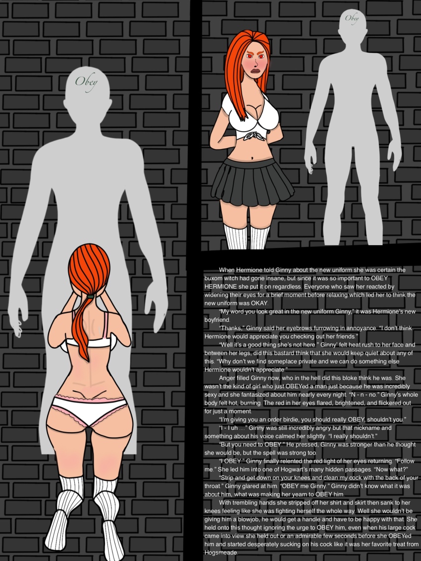
1

>> #376580
Score: 0 (vote Up)
>> #376608
Score: 0 (vote Up)
Also, I don't think you ever need too feel like you have to post stuff as quickly as possible and release stuff you're not happy with. Been there when I was in school and had a lot of time to make manips on here. Don't let it take forever but also don't feel like it has to go out before its ready.
So I might be stepping outside what you were asking for what I think, so sorry about that, but here I go.
I can't really speak much to how to improve your writing, I've tried to write some stuff before and I really suck at it, the art I might be more able too speak too.
First thing is I'd be a little careful about the anatomy, specifically the neck area in the first drawing, usually the joining connecting the shoulder to the arm is at the same height as the part where the shoulder meets the neck, then a small curved like (simplifying here) transition from the shoulder too the neck. You definitely got it about right in the second panel.
Second thing, and this might be more of a personal preference but I do think it is more objective is that if your text is as small as this you might want to consider having it on a solid background just to make it a little easier to read. It's not really hard right now but it does require some more focusing to separate the text from the background. You could maybe also consider another font, though this really is fully preferential. I know a lot of people on here like the CCWildWords or Ames Pro font but that might be too anime/manga inspired.
Last thing is really minor because I assume it might have been a small oversight but the gray male characters legs are cut off in the second panel at the knees, might want to have a look at that.
Looking forward to any further entries!