Search
(Supports wildcard *)Artist
- ? marine3950 (manipper) 2
General
- ? blue eyes 17121
- ? brown hair 29228
- ? fake animal ears 2639
- ? femsub 131675
- ? hat 7080
- ? kissing 3123
- ? loli 355
- ? multiple girls 15413
- ? short hair 40938
- ? sleeping 1695
- ? smile 28593
- ? wholesome 583
Meta
- ? caption 8906
- ? caption only 2823
- ? character request 1498
- ? manip 16631
- ? text 82126
Statistics
- Id: 11554
-
Posted: 2014-01-08 03:48:34
by deleted001 - Size: 800x1200
- Source: www.animegalleries.net/img/316114
- Rating: Safe
- Score: 74 (vote up)
>> #7475
Score: 0 (vote Up)
>> #7476
Score: 0 (vote Up)
>> #7479
Score: 1 (vote Up)
this is so cute TnT
>> #7482
Score: 0 (vote Up)
My first post here. I just know that I've already done something wrong.
Don't be so pessimistic! Your post looks alright. As far as I'm aware, you broke no rules (I made the rules, so I sure hope i would recognize if you broke them XD). As for the manip itself, the writing is quite good; no big issues there. The only "problems" I'd point out are your choice of font, your choice of background color for the text area, and the default left-alignment of the text.
* Your font of choice, while alright, is just...boring. It's not aesthetically pleasing, is all. Your manips would be better off if you found another font to use that looks more decorative but isn't hard to read.
* Your color choices of pitch white for the background and pitch black for the font are a little less aesthetic. Text on pure white backgrounds are generally stressful on the eyes of the reader. Background colors, if you want to use white, should be an off-white. Not quite gray, but not quite bright white, either. Black text color is usable, but, like the point above, is just boring.
* Lastly, you should probably work on your text alignment. See how the text seems to be crashing up against the side of the image at the start of every line? It makes it look less well made when it does that. One simple solution would be to change the type of alignment you use. Maybe align the text to the center. However, for longer texts, that may not work well. In cases with text as large as your caption, you may wish to simply indent the text a little bit, pushing it away from the side of the image. It makes a big difference, despite being so simple.
All in all, it's pretty good. I hope you continue writing new text manips. :)
>> #7487
Score: 0 (vote Up)
Don't be so pessimistic! Your post looks alright. As far as I'm aware, you broke no rules (I made the rules, so I sure hope I would recognize if you broke them XD). As for the manip itself, the writing is quite good; no big issues there. The only "problems" I'd point out are your choice of font, your choice of background color for the text area, and the default left-alignment of the text.
All in all, it's pretty good. I hope you continue writing new text manips. :)
Alright, thanks. I'm sitting on a couple of other works in progress, so I'll make sure that I apply that to them before I submit. Thanks for the ConCrit.
>> #7489
Score: 0 (vote Up)
Alright, thanks. I'm sitting on a couple of other works in progress, so I'll make sure that I apply that to them before I submit. Thanks for the ConCrit.
Anytime. :)
>> #7492
Score: 0 (vote Up)
>> #7493
Score: 0 (vote Up)
>> #7498
Score: 0 (vote Up)
>> #7501
Score: 0 (vote Up)
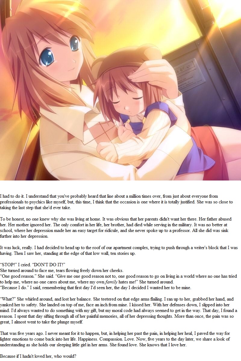
That said, OH GOD THE FEELS. Amazing story, adorable picture.