Search
(Supports wildcard *)Copyright
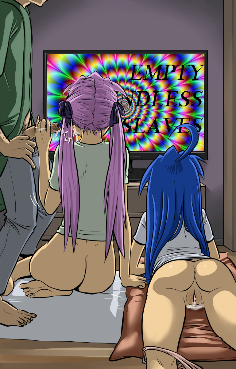
- ? lucky star 56
Character
- ? kagami hiiragi 27
- ? konata izumi 29
Artist
- ? spidu 10
General
- ? age difference 1845
- ? anus 3270
- ? ass 14324
- ? blue hair 13152
- ? bottomless 40822
- ? cum 14715
- ? cum in pussy 5044
- ? cum on body 4012
- ? cum on face 2499
- ? handjob 2051
- ? hypnotic screen 2704
- ? panties 8370
- ? penis 26736
- ? pink hair 10433
- ? pussy 17859
- ? pussy juice 9870
- ? tech control 23068
- ? underwear 11412
Meta
- ? manip 16629
- ? text 82428
Statistics
- Id: 44397
-
Posted: 2017-01-23 14:18:42
by dmcman - Size: 769x1200
- Source: www.pixiv.net/member_illu...um&illust_id=19730399
- Rating: Explicit
- Score: 130 (vote up)

>> #152267
Score: 1 (vote Up)
P.S I have been practising hypnosis on Omegle but I would like to find someone to hypnotize on here. I promise to respect limits. You will be helping me with my technique while having hypnotic pleasure. Win-win :). Send me a message if interested. (Preferably female please).
>> #152273
Score: 0 (vote Up)
Bottom line, you could probably have saved yourself work while simultaneously improving quality by just letting the "technicolor mindfuck" swirls speak for themselves.
>> #152278
Score: 0 (vote Up)
>> #152279
Score: 0 (vote Up)
repost of hypnohub.net/post/show/49...cum-drool-empty_eyes-fems ?
Slightly different.
>> #152298
Score: 0 (vote Up)
>> #152320
Score: 0 (vote Up)
Slightly different.
Other font, removed faces.
Is it even "legal" to post minimal alterations of already existing manips with literally bringing nothing new to the table? ^^
>> #152383
Score: 0 (vote Up)
>> #152384
Score: 0 (vote Up)
Text quality leaves something to be desired, in my opinion. That font looks janky at the best of times and is especially jarring here. It seems to clash with the smooth lines of the source art.
I chose that font because it looks very "techy" if that makes sense.
>> #152393
Score: 0 (vote Up)