Search
(Supports wildcard *)Copyright
- ? disney 8327
- ? love live! 275
- ? love live! school idol project 165
- ? the jungle book 5349
Character
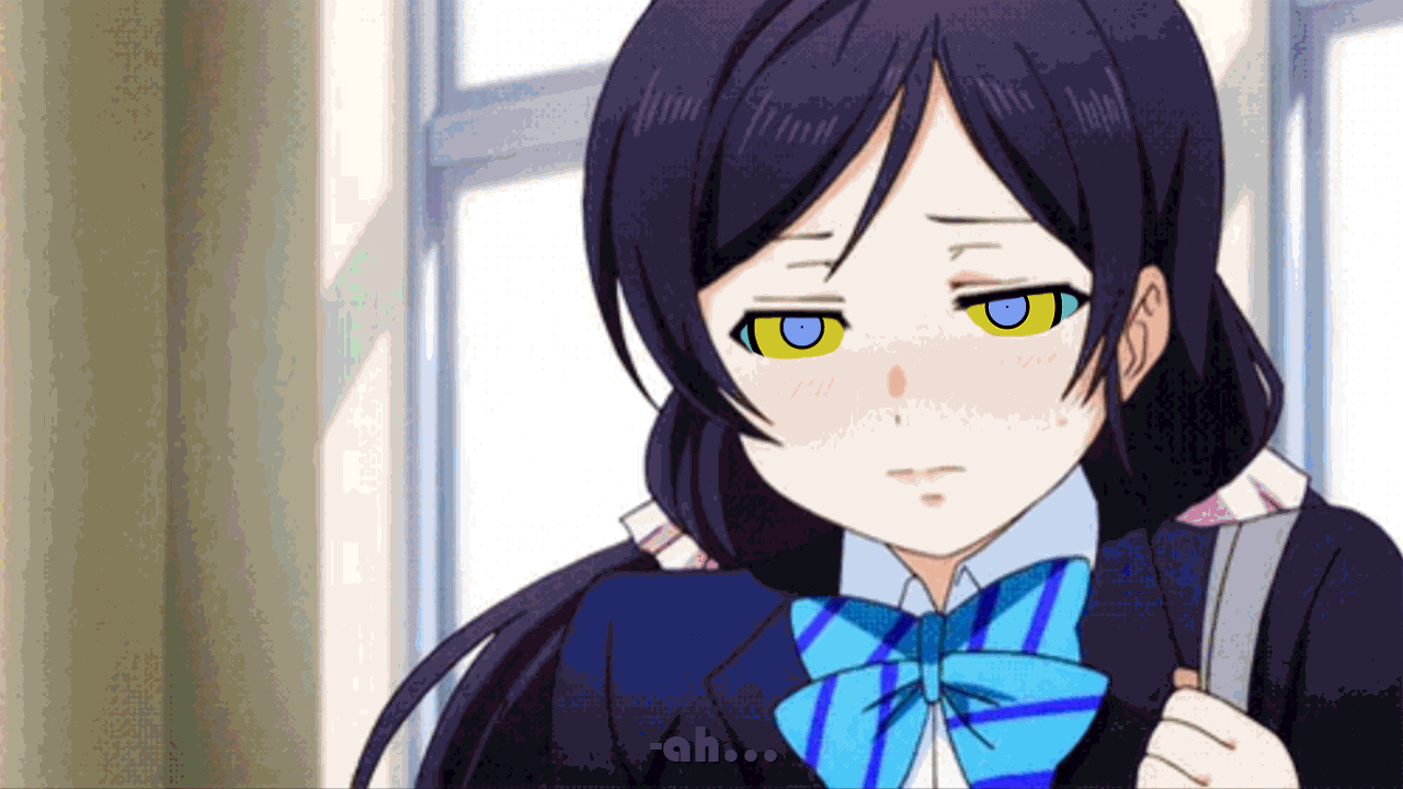
- ? kaa 5262
- ? nozomi toujou 90
Artist
- ? happyhypno (manipper) 84
General
- ? femsub 133868
- ? happy trance 47029
- ? kaa eyes 12829
- ? long hair 58530
- ? maledom 36107
- ? ping 510
- ? school uniform 5826
- ? smile 29018
- ? snake 8484
- ? twintails 10893
Meta
- ? animated 8995
- ? animated gif 6550
- ? dialogue 23469
- ? manip 16689
- ? text 83858
Statistics
- Id: 61993
-
Posted: 2018-03-22 03:29:16
by kanoz - Size: 1280x720
- Source: happyhypno.deviantart.com/art/Kaa-and-Nozomi-PING-736498554
- Rating: Safe
- Score: 94 (vote up)
This image has been resized. Click here to view the original image.
Always view original.
Don't show this message.

1

>> #241424
Score: 0 (vote Up)
>> #241434
Score: 0 (vote Up)
>> #241436
Score: 0 (vote Up)
no it doesn't, the eye effects are in a completely different contrast to the gif itself, it's amazingly jarring.
this
>> #241440
Score: 0 (vote Up)
no it doesn't, the eye effects are in a completely different contrast to the gif itself, it's amazingly jarring.
I think he meant that the text fit with the gif, which I can agree with
>> #241441
Score: 0 (vote Up)
no it doesn't, the eye effects are in a completely different contrast to the gif itself, it's amazingly jarring.
the guy who did the gif is learning to do them, maybe he's wrong at the beginning
>> #241442
Score: 0 (vote Up)
>> #241453
Score: 0 (vote Up)
>> #241541
Score: 0 (vote Up)
>> #241572
Score: 0 (vote Up)
IMO, everything except the fact that the eyes look much more crisp than the rest of the image looks good.
That and the fact that using purple font with half of it going onto a purple uniform does not make text easy to read.