Search
(Supports wildcard *)Copyright
- ? digimon 763
Character
- ? renamon 148
Artist
- ? furrwhore (manipper) 82
- ? nicopossum 3
General
- ? bra 4596
- ? femdom 32720
- ? furry 19588
- ? pussy 19884
- ? spiral eyes 26029
- ? symbol in eyes 34586
- ? underwear 12132
Meta
- ? manip 17381
- ? simple background 14236
- ? tagme 9116
- ? text 90497
Statistics
- Id: 87185
-
Posted: 2019-11-12 08:28:05
by Furrwhore - Size: 1998x1623
- Source: twitter.com/LewdPossPal/status/1081323240432300033
- Rating: Explicit
- Score: 74 (vote up)
This image has been resized. Click here to view the original image.
Always view original.
Don't show this message.
1

>> #343568
Score: 0 (vote Up)
>> #343569
Score: 0 (vote Up)
>> #343572
Score: 0 (vote Up)
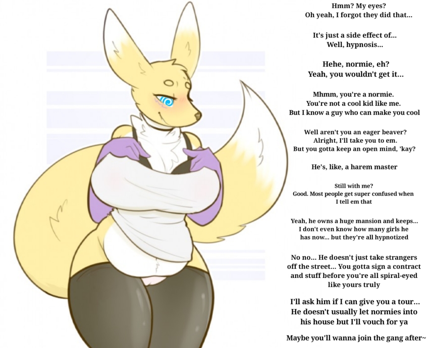
They look poorly Photoshop-ed in.
>> #343578
Score: 0 (vote Up)
>> #343579
Score: 0 (vote Up)
She got some chonk. Good chonk.
Best chonk~
>> #343583
Score: 0 (vote Up)
the eyes don't look too good.
They look poorly Photoshop-ed in.
I don't think it's much worse than a lot of stuff that's on here, in terms of quality. It doesn't bleed into the rest of hte picture and still keeps her looking in a working direction (like, you can tell where she's looking and it doesn't seem odd). The english is fine, though it doesn't *really* tell you which person is talking (though I think it's safe to assume the renamon is talking?)
Anyway, I vote it stays. I don't know if the moderation/quality thing is still voting or not, but there's my piece ;P
>> #343594
Score: 0 (vote Up)
the eyes don't look too good.
They look poorly Photoshop-ed in.
I don't think that's reason to delete the pic. The hypno is clear, and the text is good. Sure, the eyes could be better, but it's not like they clash with the rest of the pic's style or are so out-of-bounds as to invade her face and ruin it.
>> #343596
Score: 0 (vote Up)
I don't think that's reason to delete the pic. The hypno is clear, and the text is good. Sure, the eyes could be better, but it's not like they clash with the rest of the pic's style or are so out-of-bounds as to invade her face and ruin it.
Its in the hands of the qcc now.
>> #343599
Score: 0 (vote Up)
the eyes don't look too good.
They look poorly Photoshop-ed in.
I don't think that's reason to delete the pic. The hypno is clear, and the text is good. Sure, the eyes could be better, but it's not like they clash with the rest of the pic's style or are so out-of-bounds as to invade her face and ruin it.
The issue isn't the eyes looking poor. It's the image itself looking like it's scaled up, which makes it appear a bit blurry compared to the spiral eye. You can compare from the Twitter source vs this one:
pbs.twimg.com/media/DwGdM...ormat=jpg&name=medium
hypnohub.net//data/image/...8cfa529643eb9f0621dc5.jpg