Search
(Supports wildcard *)Copyright
- ? original 43356
Artist
- ? applecream (manipper) 1
- ? prsmrti 2
General
- ? ahegao 4632
- ? bimbofication 7432
- ? blush 37119
- ? bottomless 41347
- ? brain drain 4107
- ? cat girl 4097
- ? cum 14942
- ? cum in mouth 2936
- ? double handjob 248
- ? drool 25454
- ? erection 7653
- ? eye roll 4816
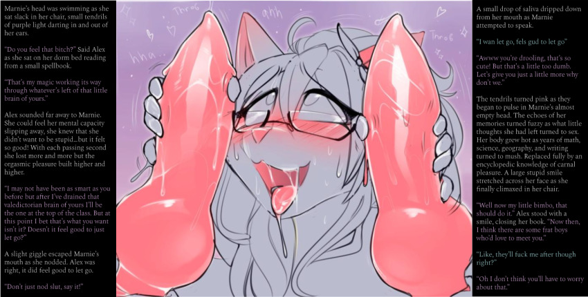
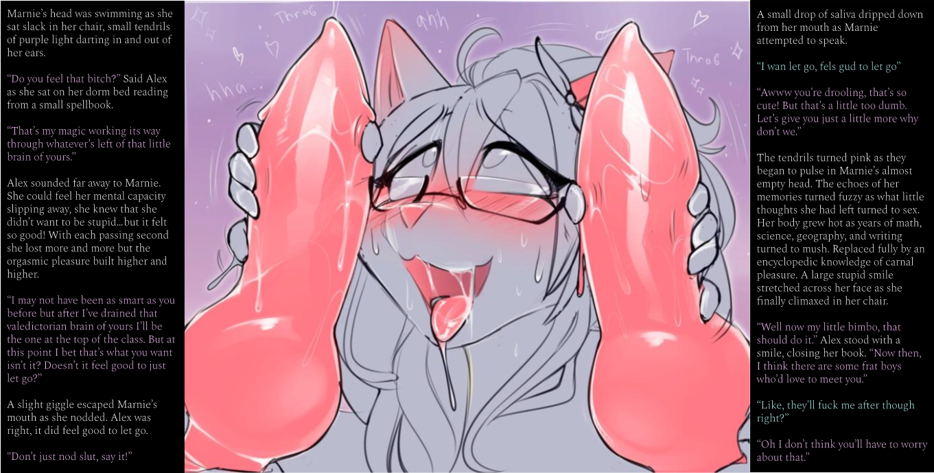
- ? femsub 133844
- ? furry 18055
- ? glasses 10252
- ? handjob 2080
- ? knotted penis 317
- ? multiple penises 1010
- ? non-human penis 2074
- ? open mouth 47452
- ? penis 27194
- ? tongue 19328
- ? tongue out 18531
Meta
- ? caption 8946
- ? manip 16688
- ? simple background 11136
- ? text 83850
Statistics
- Id: 105747
-
Posted: 2020-11-03 05:56:50
by Applecream - Size: 1361x689
- Source: twitter.com/prsmrti/status/1305229921875365888
- Rating: Explicit
- Score: 112 (vote up)
This image has been resized. Click here to view the original image.
Always view original.
Don't show this message.
1
>> #392728
Score: 0 (vote Up)
Any feedback is appreciated!
>> #392730
Score: 0 (vote Up)
First manip, hope ya'll like it.
Any feedback is appreciated!
Not bad for your first manip. I'm looking forward to seeing more from you, if you're planning on posting more ^^
I really like how the dom added back some of her brain back, pretty creative :3
>> #392731
Score: 0 (vote Up)
I'd say it's a pretty good start! I mean, you've made the first step, and that's great no matter what. The biggest thing I'd say, and you already did pretty decent on it, is make sure your text pops out enough from the background. Don't be afraid to give yourself more room so you can up the font size!
Great job overall, though!
>> #392732
Score: 0 (vote Up)
Not bad for your first manip. I'm looking forward to seeing more from you, if you're planning on posting more ^^
I really like how the dom added back some of her brain back, pretty creative :3
That means a lot coming from you! I've been a fan of yours for awhile, I'll definitely be posting more. I'm just doing this for fun, but I'd like to learn the ways of the hub!
>> #392733
Score: 0 (vote Up)
Kinda surprised that prsmrti's stuff isn't more popular on here...
I'd say it's a pretty good start! I mean, you've made the first step, and that's great no matter what. The biggest thing I'd say, and you already did pretty decent on it, is make sure your text pops out enough from the background. Don't be afraid to give yourself more room so you can up the font size!
Great job overall, though!
Thanks for the advice, glad you liked it!
I don't have editing software so I actually made this in google slides, next time I'll give myself more space and probably change the font. I definitely see what you're saying about the text.
>> #392878
Score: 0 (vote Up)
>> #394394
Score: 0 (vote Up)
>> #394404
Score: 0 (vote Up)
Thanks for the advice, glad you liked it!
I don't have editing software so I actually made this in google slides, next time I'll give myself more space and probably change the font. I definitely see what you're saying about the text.
I would highly recommend Gimp! It's free, it's fairly professional, and better than both Paint and Google Slides.
>> #466193
Score: 0 (vote Up)
You've managed to do the basic stuff. What you may need to watch out for is type choice - serif is more readable, but it is rendered at a small size by a computer the things that make it that way get washed out. This is not a unique property to serif fonts, some simply are better than others and there's a reason. I have one I cultishly use but it's good to experiment and see what works for you. Google fonts is a wonderful resource of professional type things that won't give you a virus, and there's free font websites that host crazy artist stuff.
It's a great start! There's a lot of moving parts to digital images and layout, and a lot to learn.
>> #466194
Score: 0 (vote Up)