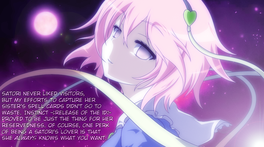
I am not sure why most ppl try to detach the text somewhat from the character of the picture by starting with the name of the character. While the image gives the Vibe of Tranquility the text starts with "Satori never liked visitors" - kind of rips me out of the whole feeling of the picture. I'd try for a more soothing approach or maybe even write it from the point of the sub (as thoughts, not as her saying it). You have to draw the viewer more into the trance with the text for the best impact. The first sentence is very important for that aspect and that she doesn't like visitors is not a fact that hits the spot here. It's often hard to find it, but try to do so.
HypnoMangaEditor said: I am not sure why most ppl try to detach the text somewhat from the character of the picture by starting with the name of the character. While the image gives the Vibe of Tranquility the text starts with "Satori never liked visitors" - kind of rips me out of the whole feeling of the picture. I'd try for a more soothing approach or maybe even write it from the point of the sub (as thoughts, not as her saying it). You have to draw the viewer more into the trance with the text for the best impact. The first sentence is very important for that aspect and that she doesn't like visitors is not a fact that hits the spot here. It's often hard to find it, but try to do so.
I see. My writing's usually like that - kind of dry and impersonal. Part of why I started trying to write stories. Its based off of her canon portrayal in Touhou - she lives on her own due to the fact that satoris are hated for their mind reading powers. Thanks a lot for the feedback; it's really helpful. I'll try writing some more, though I don't know if having more child posts would be spammy.
The position is fine. The font is standard Wild Words - maybe, just maybe you want to look for a more "romantic" font, but be careful, it still needs to be readable. You went for a black outline. I would have to see it, but making the outline white and maybe the font a little darker may work better here - hard to say though.
If you look at it, the image gets brighter the more you reach the bottom. You could go for a darker Font at the top of the text and making it brighter the closer you come to the bottom. This can be easily done by selecting the Font Layer -> "Alpha to selection" -> Add new Layer -> and then using the Blend/gradiant tool in gimp. Might even work without an outline, might work good with white, might work well with black if the font is bigger. A matter of taste.
I think the first line works fine for this manip. As Dreamshade pointed out, it's canon for her character and it sets up the before and after effect that so many in this fetish love.
I am not that familiar with this character. I am giving my advice from a neutral perspective. It might work better for people that are deep into touhou lore. I just think this could be done a little better.
Just to clarify - the image is already very good and one of the better ones that has been posted here in the past weeks. This is criticism on a high level and of course at least partly driven by personal preference. Don't be discouraged, the best ideas are always born out of the fire of criticism.

>> #11001
Score: 0 (vote Up)
>> #11005
Score: 0 (vote Up)
>> #11009
Score: 0 (vote Up)
I am not sure why most ppl try to detach the text somewhat from the character of the picture by starting with the name of the character. While the image gives the Vibe of Tranquility the text starts with "Satori never liked visitors" - kind of rips me out of the whole feeling of the picture. I'd try for a more soothing approach or maybe even write it from the point of the sub (as thoughts, not as her saying it). You have to draw the viewer more into the trance with the text for the best impact. The first sentence is very important for that aspect and that she doesn't like visitors is not a fact that hits the spot here. It's often hard to find it, but try to do so.
I see. My writing's usually like that - kind of dry and impersonal. Part of why I started trying to write stories. Its based off of her canon portrayal in Touhou - she lives on her own due to the fact that satoris are hated for their mind reading powers. Thanks a lot for the feedback; it's really helpful. I'll try writing some more, though I don't know if having more child posts would be spammy.
Does the text look okay?
>> #11012
Score: 0 (vote Up)
Does the text look okay?
The position is fine. The font is standard Wild Words - maybe, just maybe you want to look for a more "romantic" font, but be careful, it still needs to be readable. You went for a black outline. I would have to see it, but making the outline white and maybe the font a little darker may work better here - hard to say though.
If you look at it, the image gets brighter the more you reach the bottom. You could go for a darker Font at the top of the text and making it brighter the closer you come to the bottom. This can be easily done by selecting the Font Layer -> "Alpha to selection" -> Add new Layer -> and then using the Blend/gradiant tool in gimp. Might even work without an outline, might work good with white, might work well with black if the font is bigger. A matter of taste.
>> #11032
Score: 0 (vote Up)
>> #11043
Score: 0 (vote Up)
Just to clarify - the image is already very good and one of the better ones that has been posted here in the past weeks. This is criticism on a high level and of course at least partly driven by personal preference. Don't be discouraged, the best ideas are always born out of the fire of criticism.