Search
(Supports wildcard *)Copyright
- ? original 43085
Character
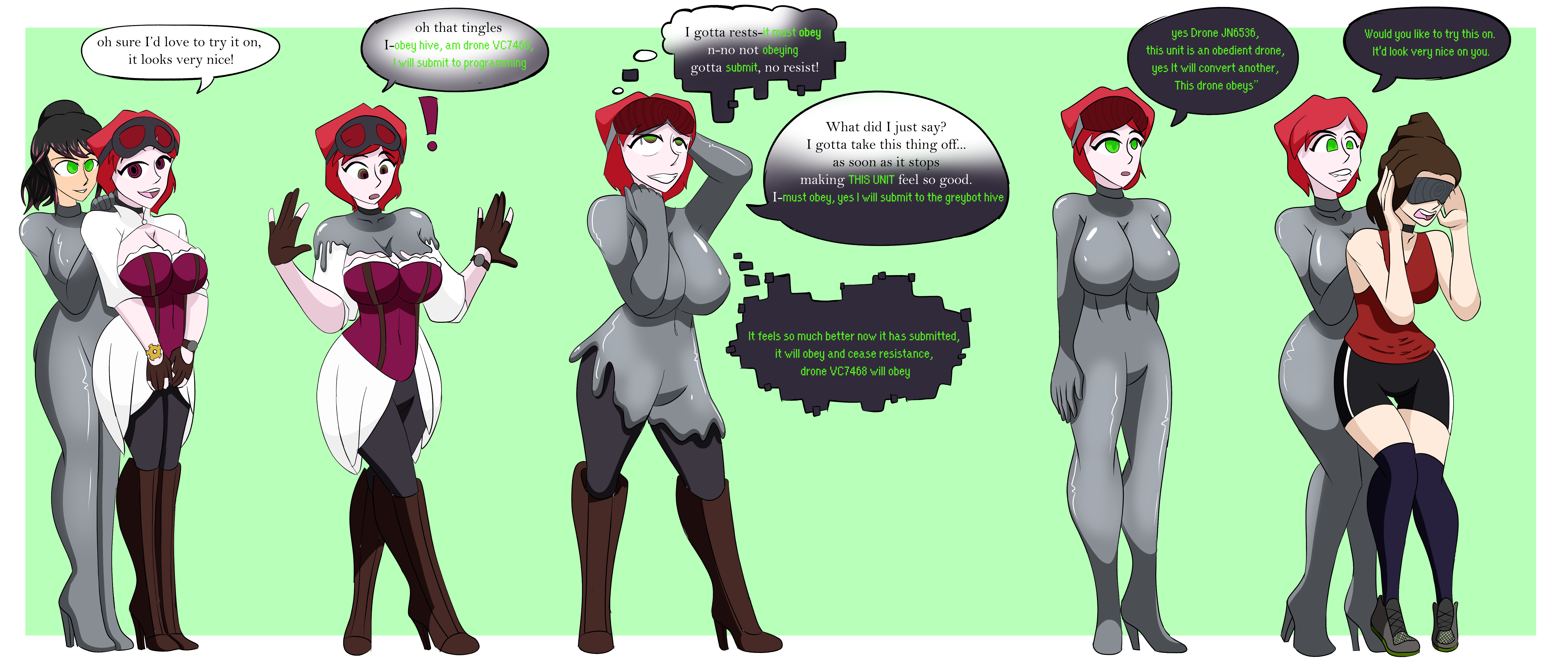
- ? jade (aetheria jade) 82
- ? victoria cross (the us doctor) 13
Artist
- ? the us doctor 182
General
- ? black hair 30466
- ? bodysuit 6704
- ? breasts 103888
- ? collar 13678
- ? drone 1623
- ? empty eyes 36395
- ? female only 57342
- ? fembot 1163
- ? femdom 30181
- ? femsub 132772
- ? graybot 398
- ? happy trance 46743
- ? high heels 10109
- ? hypnotic clothing 404
- ? hypnotized hypnotist 3723
- ? large breasts 58414
- ? long hair 58169
- ? memetic control 674
- ? multicolored hair 6350
- ? open mouth 47115
- ? purple hair 11140
- ? resisting 4717
- ? robot 2332
- ? robotization 2530
- ? smile 28759
- ? standing 12531
- ? standing at attention 5727
- ? tech control 23112
- ? visor 4615
Meta
- ? absurdres 34585
- ? text 83125
Statistics
- Id: 136377
-
Posted: 2022-01-24 16:51:39
by The_US_Doctor - Size: 6744x2833
- Source: twitter.com/The_US_Doctor/status/1485639110337261570?s=20
- Rating: Questionable
- Score: 109 (vote up)
This image has been resized. Click here to view the original image.
Always view original.
Don't show this message.

1

>> #455624
Score: 0 (vote Up)
>> #455627
Score: 0 (vote Up)
>> #455629
Score: 0 (vote Up)
No one considers readability. Why is this? Bright green on white background is unreadable.
I tried to make this very readable, I really did try, this was as good as I could I do.
>> #455645
Score: 1 (vote Up)
No one considers readability. Why is this? Bright green on white background is unreadable.
No one gives people the benefit of the doubt. Why is this? When there's an obstacle or inconvenience in the way, the only explanation is someone had a complete lack of care and concern for the potential problem.
...
My snarkiness aside, and while I don't disagree the one and a half sections that are white on grean are more difficult to read... I think there is a better way to convey that constructive feedback.
@USDoctor I appreciate what you were going for. Maybe allow a bit more grey in the background for the green text next time, or maybe change the font but keep it black at first while it's still over white. With the latter, you still give the impression she's being converted with the font change, but don't allow impose the more difficult green colored text until you've moved to the grey background. Whatever you do the future, I was still able to enjoy and appreciate what you created and shared, even if it took a bit more effort to enjoy. Thanks for posting and sharing! :D
>> #455685
Score: 0 (vote Up)
No one gives people the benefit of the doubt. Why is this? When there's an obstacle or inconvenience in the way, the only explanation is someone had a complete lack of care and concern for the potential problem.
...
My snarkiness aside, and while I don't disagree the one and a half sections that are white on grean are more difficult to read... I think there is a better way to convey that constructive feedback.
@USDoctor I appreciate what you were going for. Maybe allow a bit more grey in the background for the green text next time, or maybe change the font but keep it black at first while it's still over white. With the latter, you still give the impression she's being converted with the font change, but don't allow impose the more difficult green colored text until you've moved to the grey background. Whatever you do the future, I was still able to enjoy and appreciate what you created and shared, even if it took a bit more effort to enjoy. Thanks for posting and sharing! :D
I'm glad you enjoyed! I appreciate the feedback!