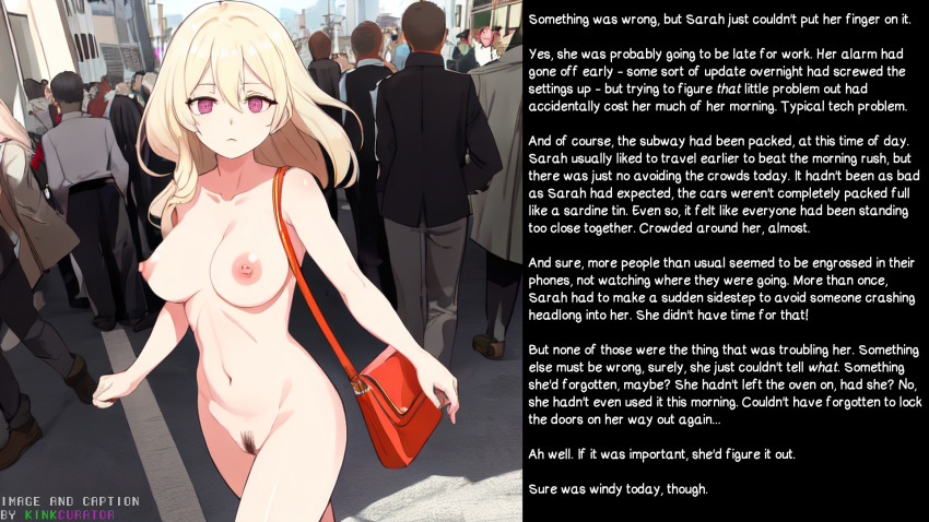
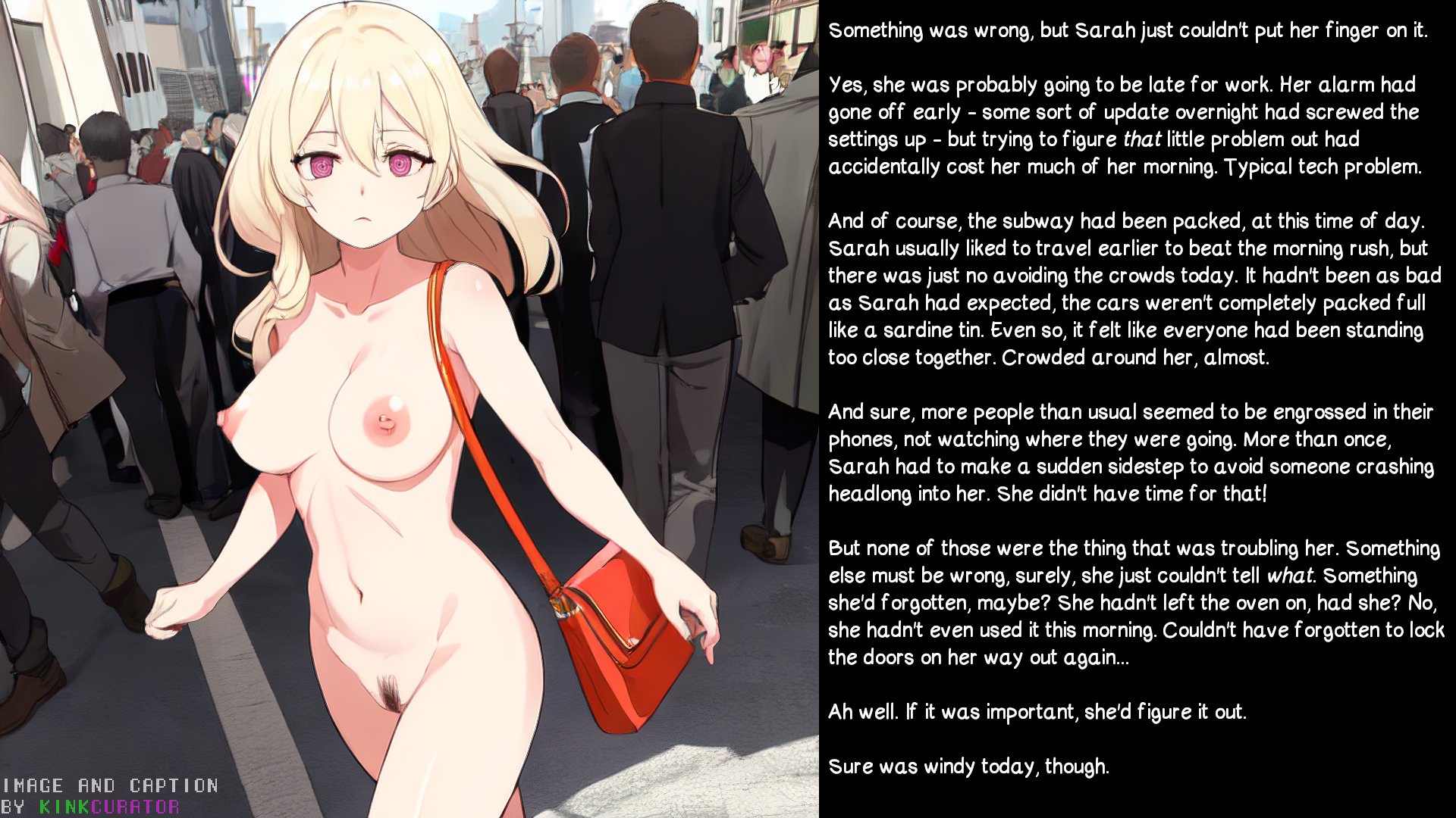
Search
(Supports wildcard *)Copyright
- ? original 43066
Artist
- ? kinkcurator (manipper) 9
General
- ? altered perception 2021
- ? blonde hair 33304
- ? bottomless 40929
- ? business suit 543
- ? exhibitionism 1434
- ? femsub 132649
- ? nude 38771
- ? outdoors 1315
- ? pink eyes 8289
- ? purple eyes 6787
- ? spiral eyes 23826
- ? symbol in eyes 32320
- ? tech control 23107
- ? topless 44710
- ? unaware 5718
Meta
- ? ai art 2215
- ? caption 8921
- ? manip 16648
- ? text 82930
Statistics
- Id: 181208
-
Posted: 2023-09-20 20:50:20
by kinkcurator - Size: 1920x1080
- Rating: Explicit
- Score: 88 (vote up)
This image has been resized. Click here to view the original image.
Always view original.
Don't show this message.
1

>> #520985
Score: 2 (vote Up)
>> #521010
Score: 3 (vote Up)
>> #521017
Score: 2 (vote Up)
But I also know that time spent does not necessarily mean quality of result, so I'm open to suggestions. Like if there were tags I forgot - did a mod add some of the ones like topless/bottomless, or were those automatic when I added nude? was I not supposed to tag myself as the generator and writer as well? - or if there's some pointers on laying text out better. I feel pretty confident in the main concept and execution, but little details are hard to nail sometimes.
>> #521066
Score: 2 (vote Up)
>> #521174
Score: 1 (vote Up)
This site is really not about perfection tbh. Its a mess of passion and horny excitement ;). You made it, you shared it. The polish is appreciated but not a requirement. Its worth looking at. End of story.
I personally wouldnt have noticied its an ai gen at all. Like most people i often use my phone. You did a good job cleaning it up.
About the font. You really cant go wrong unless you pick a wriggly font. The more important part is the color imo. As long as it pops its good. Light vs dark shades usually gets that done. Unless you start doing some text manipulation stuff, its not something to worry about. (Coming from a graphic designer who is anal about text clarity)
>> #521289
Score: 0 (vote Up)
As for the font, the typeface troubled me less than the size and spacing. I've often been annoyed by captions that are hard to read without zooming in, even when viewing them full-screen. I'm still not quite sure I nailed it, but I think I did better than most. Might try making it slightly bigger next time... which will force me to be even more concise with my writing. I could use the practice.