Search
(Supports wildcard *)Copyright
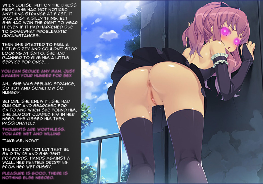
- ? the familiar of zero 44
Character
- ? louise francoise le blanc de la valliere 24
Artist
- ? heavenly (manipper) 6
- ? munashi mujou 2
General
- ? anus 3270
- ? ass 14324
- ? bent over 1116
- ? blush 36739
- ? femsub 132115
- ? frills 225
- ? glowing 15753
- ? glowing eyes 16721
- ? hypnotic clothing 403
- ? maid 3872
- ? maledom 35434
- ? no panties 640
- ? open mouth 46981
- ? pink eyes 8224
- ? pink hair 10433
- ? ponytail 12315
- ? pussy 17858
- ? pussy juice 9870
- ? skirt 10791
- ? upskirt 1162
Meta
- ? caption 8912
- ? manip 16628
- ? text 82421
Statistics
- Id: 25922
-
Posted: 2015-05-08 22:37:16
by Heavenly - Size: 1140x800
- Source: gelbooru.com/index.php?page=post&s=view&id=2532390
- Rating: Explicit
- Score: 211 (vote up)
This image has been resized. Click here to view the original image.
Always view original.
Don't show this message.

>> #56167
Score: 0 (vote Up)
>> #56173
Score: 0 (vote Up)
Ooops, thought source would work as author and put the one from Gelbooru who made it there. My mistake, not sure how to Change that...
Click "edit" under the picture. You can change the source there.
>> #56174
Score: 0 (vote Up)
>> #56178
Score: 0 (vote Up)
>> #56179
Score: 0 (vote Up)
>> #56189
Score: 0 (vote Up)
>> #56191
Score: 0 (vote Up)
Hmm ... I think you overdid the eyes. I'd even go so far as to call our quality team on this. Something simpler would have been a lot better. Not a fan of the blurry text as well. If I have to zoom in to read the text (take into account, that some people look at it via their phone/tablets), the manip kind of losses a lot of its effect.
Eh. I personally don't think it's that bad.
The blurry text is perfectly readable to me, it's more a style choice for "that little voice in the back of your head" than actual proof of poor quality.
The eyes could be better if the glow effect wasn't outside of them, but it's definitely not bad enough to complain.
It's not a professional-quality manip yet, but certainly not something the QCC needs to get involved in.
>> #56224
Score: 0 (vote Up)
i want that dress
>> #56235
Score: 0 (vote Up)
>> #56250
Score: 0 (vote Up)
The blurry text is perfectly readable to me, it's more a style choice for "that little voice in the back of your head" than actual proof of poor quality.
It's readable on a 20"+ monitor. It's barely readable on a 10" Tablet and unreadable on a 4.5" phone display.
The eyes could be better if the glow effect wasn't outside of them, but it's definitely not bad enough to complain.
That's a perfectly valid opinion that I don't share with you. It's barely better than just blurring out the whole eye area. If you want a glow, you have to do it right, otherwise it just looks bad. The eyes are the most important part of the manip and most images get pulled because the eyes weren't done right. I think this picture qualifies to at least have them have a second look at it. If they decide it can stay, then it's fine.
I love the choice of the base image though - it's perfect for a manip.