This post has
child posts.
Child posts are often subsequent pages of a doujinshi, or minor variations of the parent post.
This post belongs to a
parent post.
Child posts are often subsequent pages of a doujinshi, or minor variations of the parent post.

1
>> #103627
Score: 0 (vote Up)
>> #103644
Score: 0 (vote Up)
the fucking source artist forgot kyouko's cute little fang
Heretic! We must find him! He shall burn for his crimes!
>> #103654
Score: 0 (vote Up)
>> #103656
Score: 0 (vote Up)
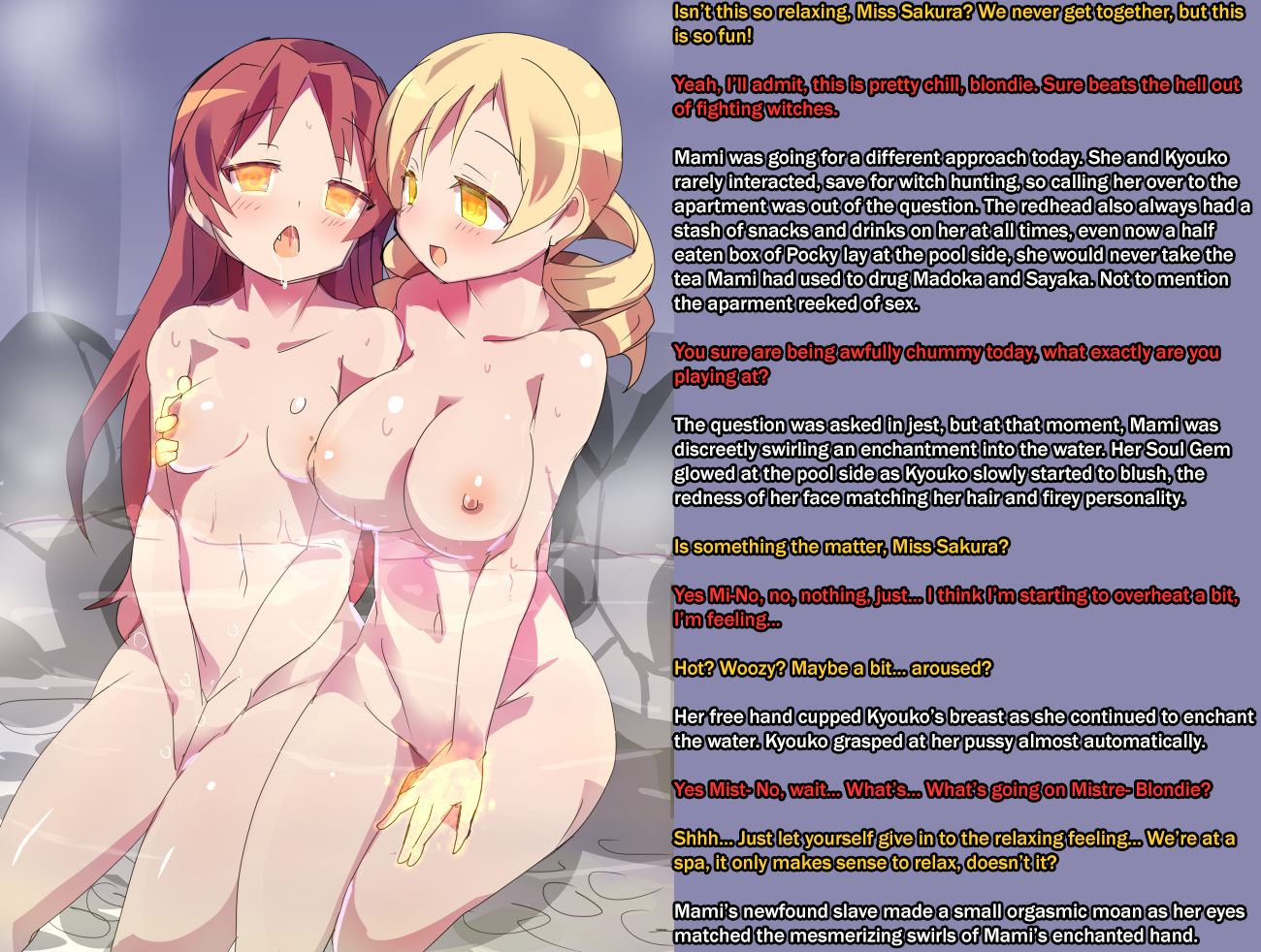
This one's a lot better, though the text is still too much. It's too close to the picture, you need to leave at least some space so it doesn't look cramped. You should also think about using another Font (Anime Ace and Wild Words are commonly used). Another thing I would like you to try is to make the text color white for all conversation and instead color the outlines according to the person that is talking. Doesn't work with all backgrounds, but with most and will further contribute to making the text less oppressive as it is in most cases with black outlines.
yeah the closeness of the text to the picture was something i noticed only after i already saved the file, otherwise i would have done something about that. but i'm not sure if i agree about switching around the color scheme or the font, but maybe that's just to my personal preference. like for characters with lighter colored text, like you said, it wouldn't work on every background, in fact i think that would only work on a black background for a character like mami. also, i generally like to keep the text's background the same color as the picture's background since i feel it makes it look more organic, i guess is the word, but again, that's just my preference. also, i really just don't care for anime ace all that much, i don't know what it is, i think it's because i've seen it in so much stuff online that i'm kind of sick of it. i don't know. i'm not trying to shut you down, especially since i agreed with pretty much everything you said about the last picture, and if more people agree with you, i'll definitely see about switching things around in the future.
>> #103668
Score: 0 (vote Up)
>> #103671
Score: 0 (vote Up)
I think it is more a question of if you want your font to be more like the font on normal websites you visit or like in Manga you read. Given that we have mostly Anime/Manga Images here, most will probably prefer the later.
that's a pretty fair point. i'll probably stick with this font for the last picture of this series for consistency's sake and because of my previous concerns with yellow text on colored background but i'll toy around with the idea in photoshop and see if it's more to my liking than what i've been doing.
>> #103801
Score: 0 (vote Up)
last picture of this series
correction: last pictures. they'll both be up tomorrow.