Search
(Supports wildcard *)Copyright
- ? capcom 1491
- ? final fight 28
- ? street fighter 1047
Character
- ? poison 12
Artist
- ? khalitzburg 1
General
- ? bare legs 3578
- ? barefoot 11967
- ? blue eyes 17124
- ? feet 8967
- ? femdom 30049
- ? foot focus 1454
- ? hypnotic feet 296
- ? long hair 57866
- ? looking at viewer 12563
- ? pink hair 10406
- ? pov 8585
- ? pov sub 5003
- ? red hair 15608
- ? transfem 119
- ? transgender identity 205
Meta
- ? caption 8906
- ? caption only 2823
- ? manip 16631
- ? text 82130
Statistics
- Id: 18011
-
Posted: 2014-07-14 05:02:39
by Voicelesss - Size: 1104x695
- Source: www.pixiv.net/member_illu...um&illust_id=32225838
- Rating: Questionable
- Score: 112 (vote up)
This image has been resized. Click here to view the original image.
Always view original.
Don't show this message.

1

>> #22699
Score: 0 (vote Up)
>> #22723
Score: 0 (vote Up)
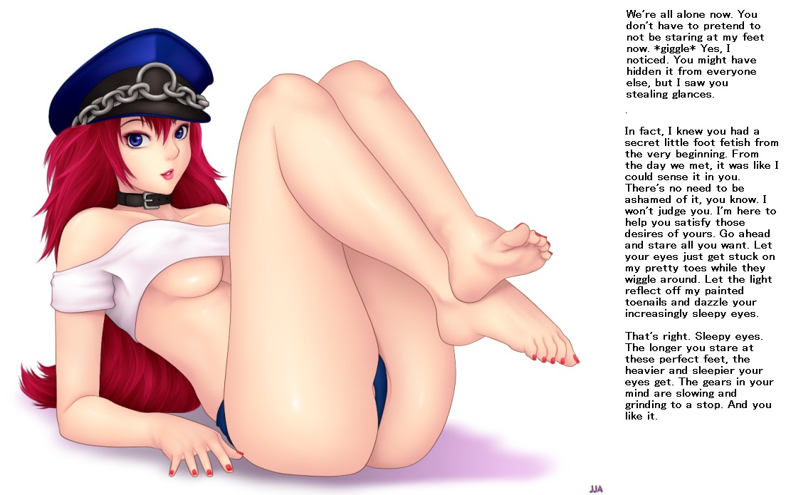
Oh, and Voiceless (I assume you manipped this), you left a stray period between the first two paragraphs. ;)
A few words of advice: beyond good writing, a good text manip also has good text aesthetics. This means things like text position and font type and color all matter. It looks off to most people at first, but captions generally look more visually pleasing if you center the text, rather than having it left justified. If you stick with left justification, each line is bound to seem jagged on one end. Centering the text results in a more even jaggedness that is almost appealing because it's uniform to both the left and right sides of the line of text. This also makes it easier for viewers to keep their place while reading.
As for color, try to avoid plain black and plain white. In this case, using white for the background of the text area that you extended is fine, because the rest of the image already uses that white as its background. However, for future reference in other cases, avoid using just plain white or black for your extended text areas and text font. Black and white are boring colors and are not appealing to the eye, so the caption ends up seeming bland and rushed, aesthetically. It also ends up looking too sharp, which can strain the eyes of readers. It's preferable to use soft colors that are still readable on the background. In this case, for example, I might have used a lighter shade of red to match the characters hair or a fairly light shade of blue to match her eyes, both of which are a common ways to decide on font colors.
>> #35707
Score: 0 (vote Up)
>> #35830
Score: 0 (vote Up)
...isn't Poison acctually a guy?
I'm not super familiar with the franchise, but, if I recall correctly, Poison is a transsexual. Please do correct me if I'm wrong, though.
>> #35864
Score: 0 (vote Up)
>> #46957
Score: 0 (vote Up)
NotFromOz said:
I'm not super familiar with the franchise, but, if I recall correctly, Poison is a transsexual. Please do correct me if I'm wrong, though.
In Fact she's a new-half (from birth as it seems)
>> #63496
Score: 0 (vote Up)
>> #63699
Score: 0 (vote Up)
And also, this should have a street fighters tag, too, because, in Street Fighters 4, she is reintroduced as a character.
Actually, I think it was Super Street Fighter 4, but it's still Street Fighter, so tag updated with justification!